Creating a user-first insurance journey in the iLyF Mobile App v2 redesign
A complete redesign to simplify onboarding, support renewal clarity, and help users personalize their experience with less effort.
Mobile App Design
Product Design
UI/UX
Context
iLyF is a mobile-first insurance app that helps users manage vehicle and travel policies. It was originally built as a form-heavy experience. For v2, we aimed to simplify how users onboard, renew, and reuse their data.
The app’s first version (v1) faced friction points: drop-offs after login, unclear renewal flows, and repeated input tasks for returning users. As the sole designer, I was brought in to rethink the mobile experience from the ground up with a focus on helping users see value faster, stay in control of their data, and come back with confidence.
Role: Product Designer
Team: 1 Product Manager, 2 Developers
Tools: Figma, Adobe Illustrator & Photoshop (for assets)
Timeline: June 2022
Result
13× user growth within 5 months post-launch in November 2022
Increased vehicle creation rate 11.8× within the same 4-month period post-redesign, indicating reduced onboarding friction and higher engagement
Achieved 20× more completed renewals after streamlining the renewal flow
Positive UI feedback, with app store reviews citing “cleaner” and “easier to use”
Served as the foundation for the v2 design system and responsive web expansion
Design Process
🔍 Discover & Define
To start, I dug into user feedback, app store reviews, and drop-off analytics. I also worked closely with our product manager to surface pain points from internal support logs. A few key problems consistently stood out:
Users dropped off after login/sign-up
Renewal flow was unclear and long
Returning users had to re-enter the same data
No way to explore the app without logging in
This led to our guiding question: How might we reduce friction while giving users more control over their insurance journey?
From there, I worked with the team to define three key design goals:
Make onboarding faster and less intimidating by showing value early
Clarify the renewal process so users know what to expect and how far they are
Support returning users with saved data and flexible flows that reflect real-world behavior
Allow guest access for low-commitment exploration
💡 Ideate & Explore
I did competitive analysis with 3 direct competitors and 2 indirect competitors.
🎨 Design & Iterate
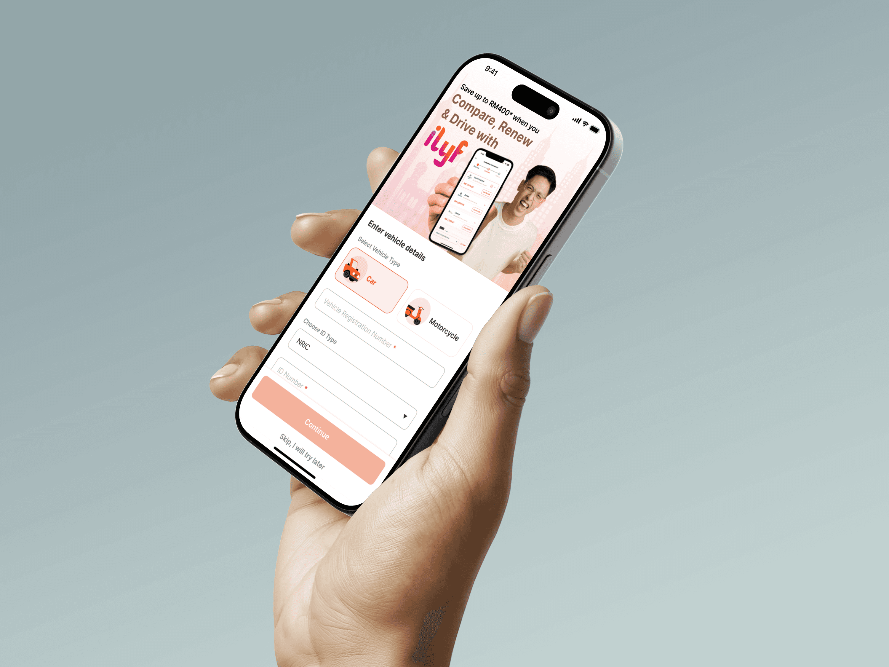
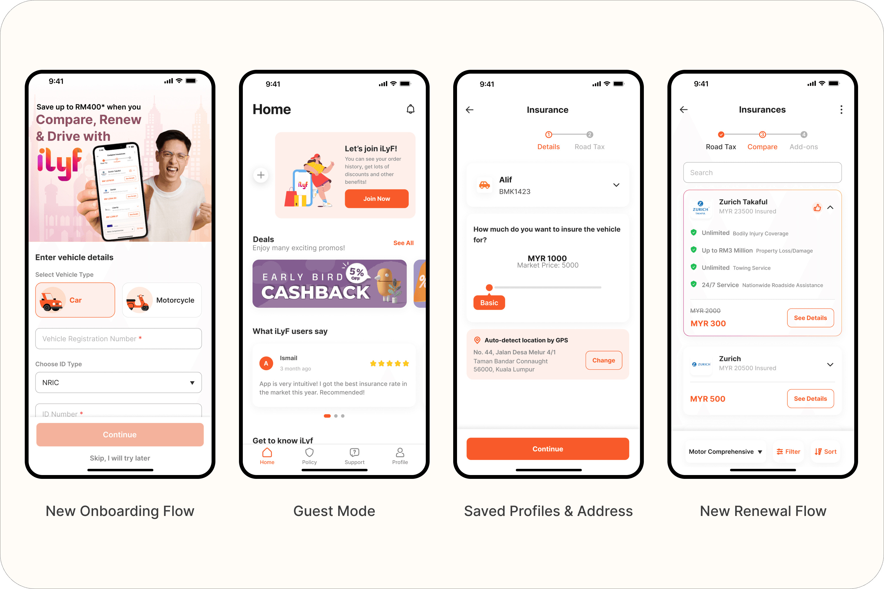
Onboarding Flow Redesign
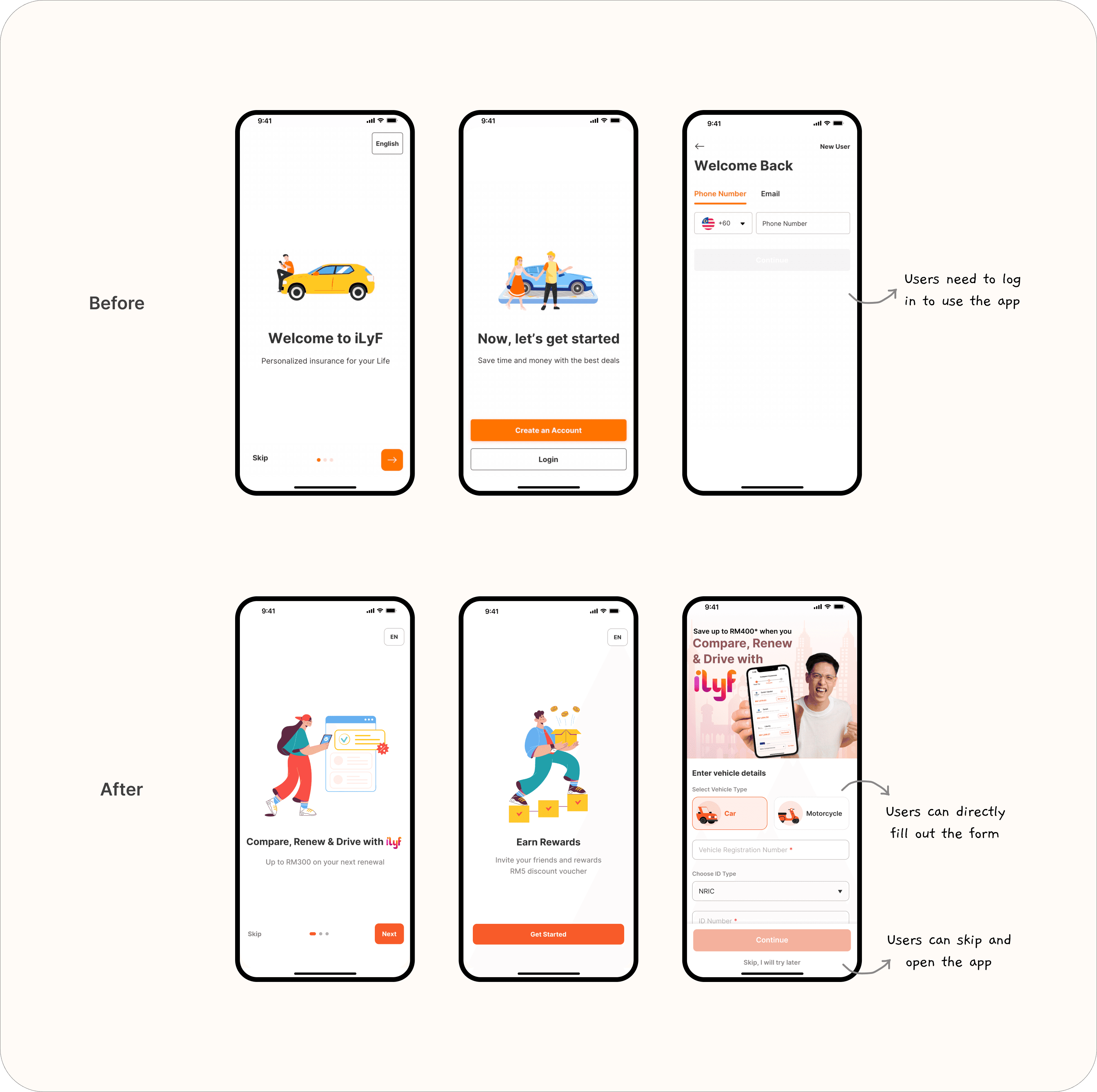
Before: Users had to sign up or log in before seeing anything. The flow included OTP verification and PIN creation, which caused drop-offs.
After: Reversed the flow, users now start by entering vehicle info to check their insurance status. They only need to sign in after that. Also combined sign-up/login into a single phone number verification page to simplify the flow.
Impact: Increased the likelihood of profile creation and renewal follow-through by showing immediate value first.
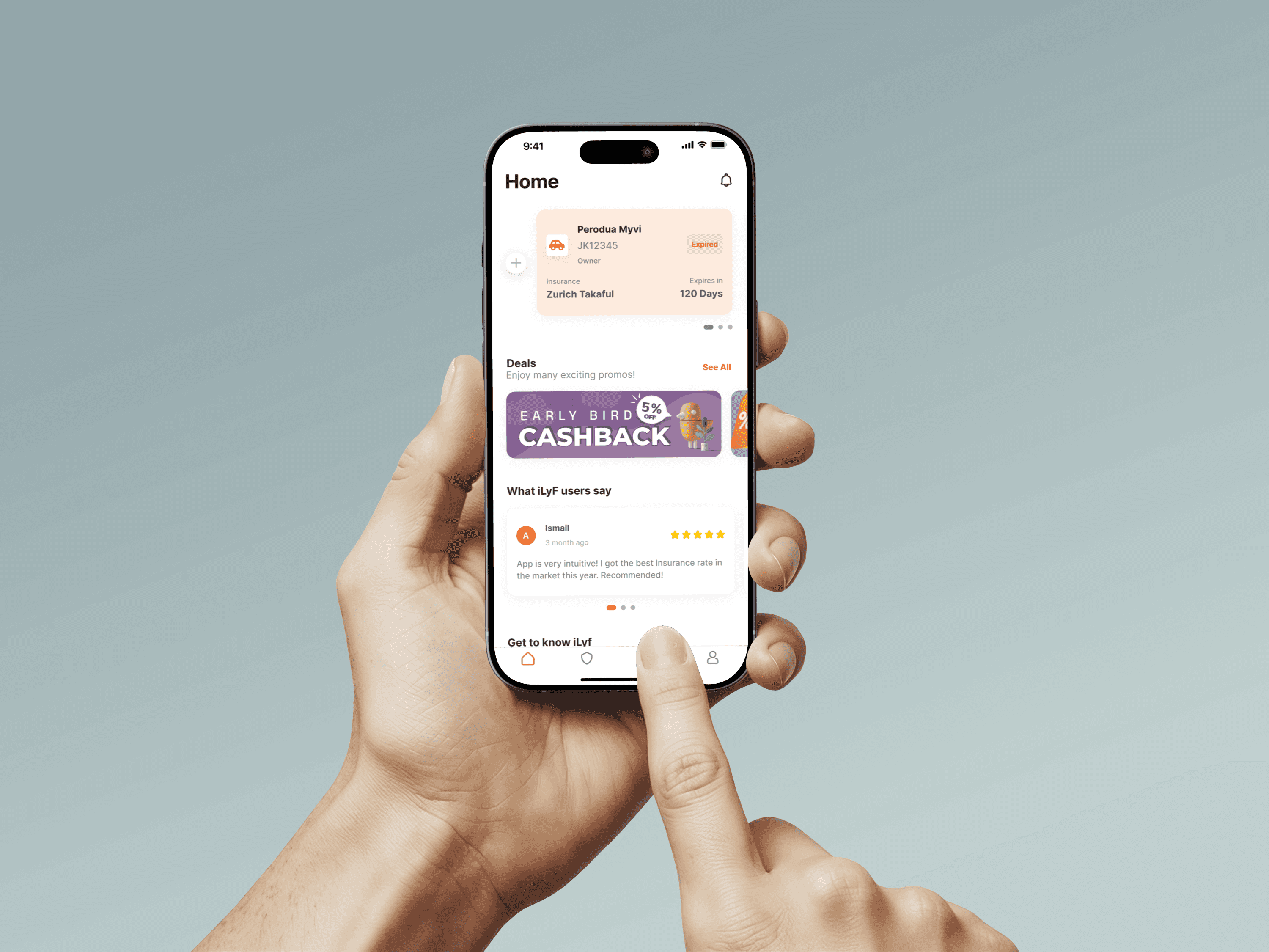
Guest Mode
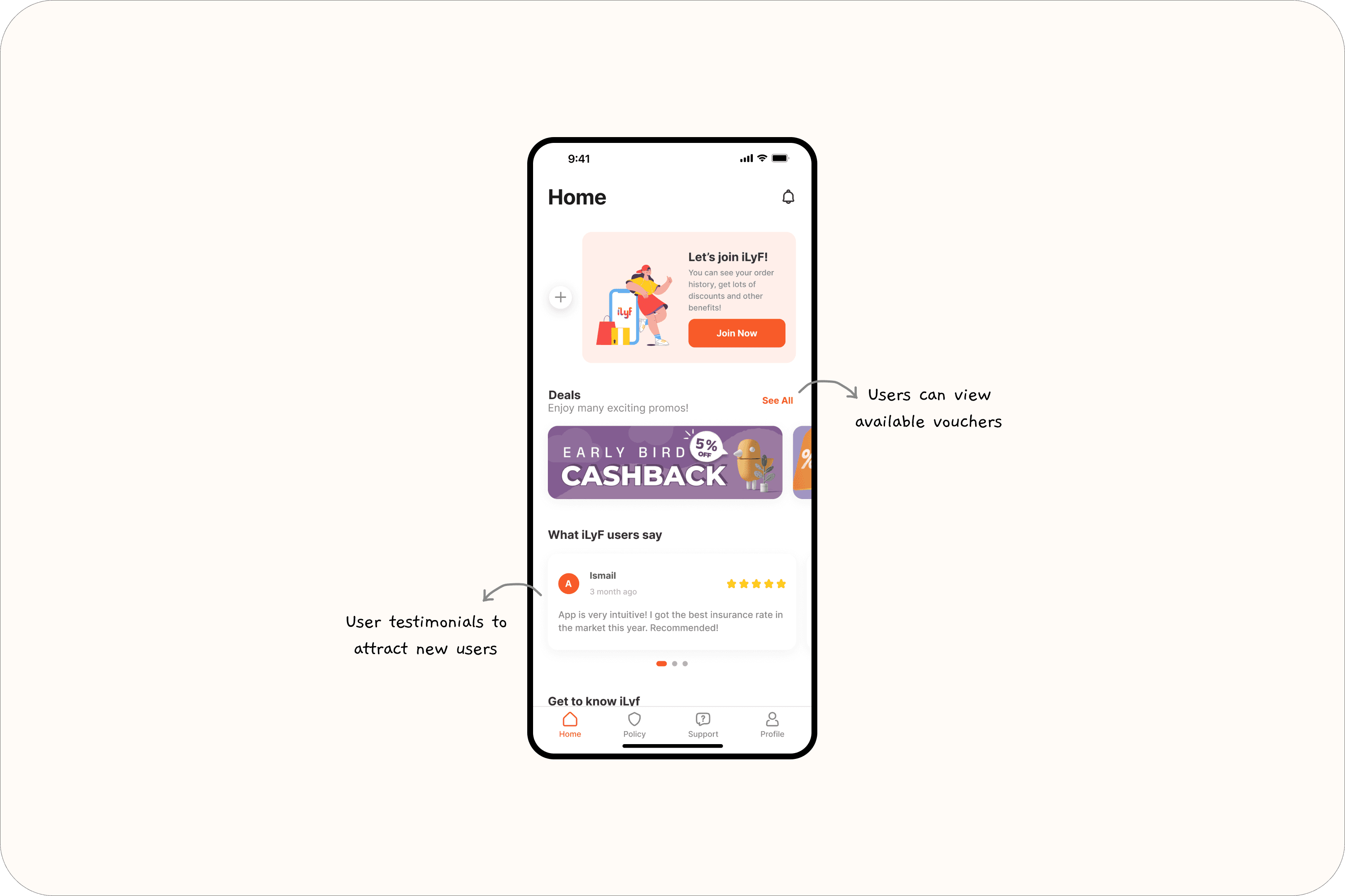
Introduced a guest mode so users can explore the app without logging in. This reduced friction for users who just want to check out the product or view pricing before committing.
Why it matters: Helped reduce drop-off at login barrier and broadened engagement from curious users.
Renewal Flow Redesign
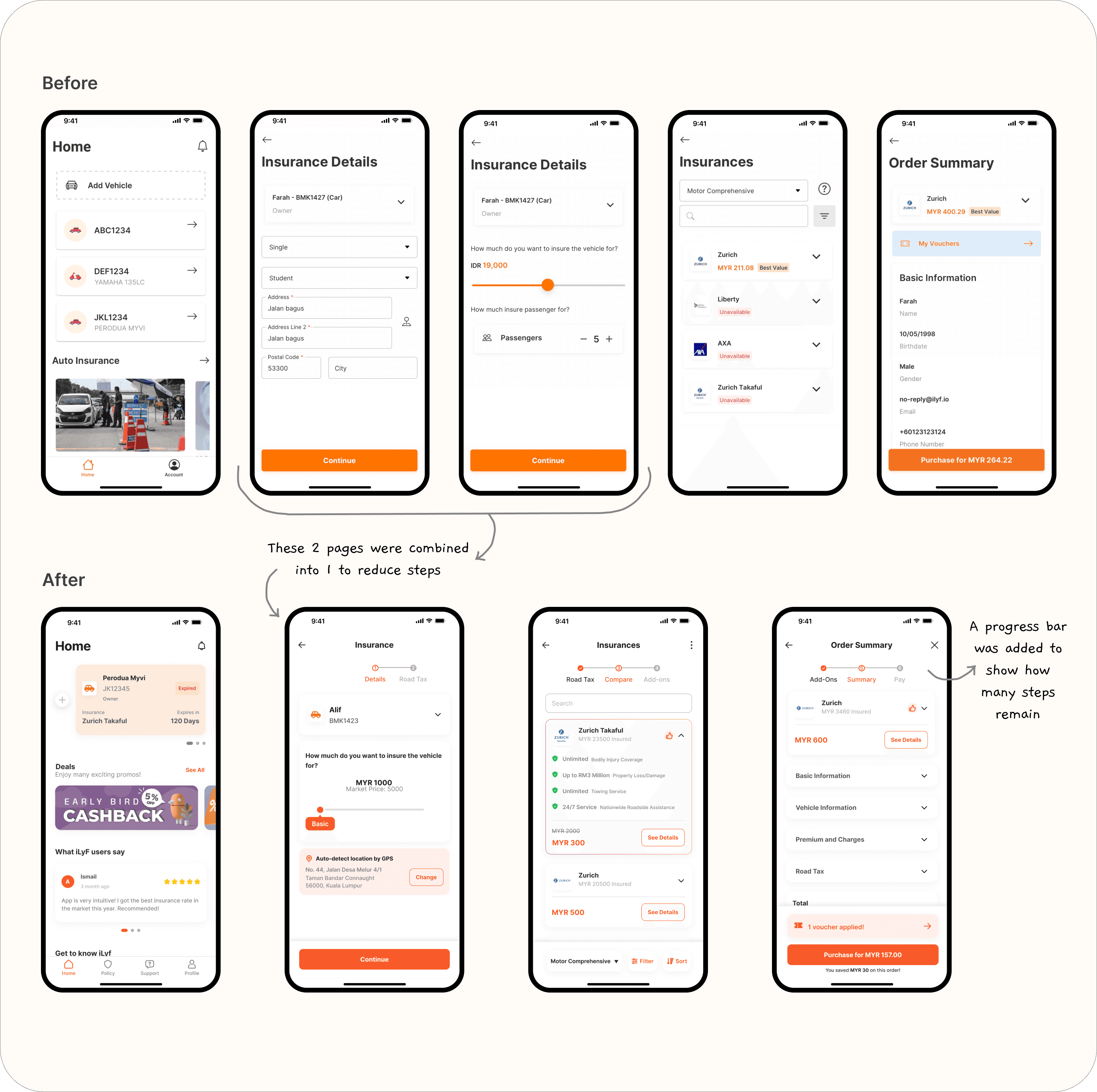
Reduced input friction by:
Grouping form steps logically
Adding a progress bar to clarify how many steps were left
Removing redundant or rarely used fields
Result: Made the renewal process feel more achievable and transparent.
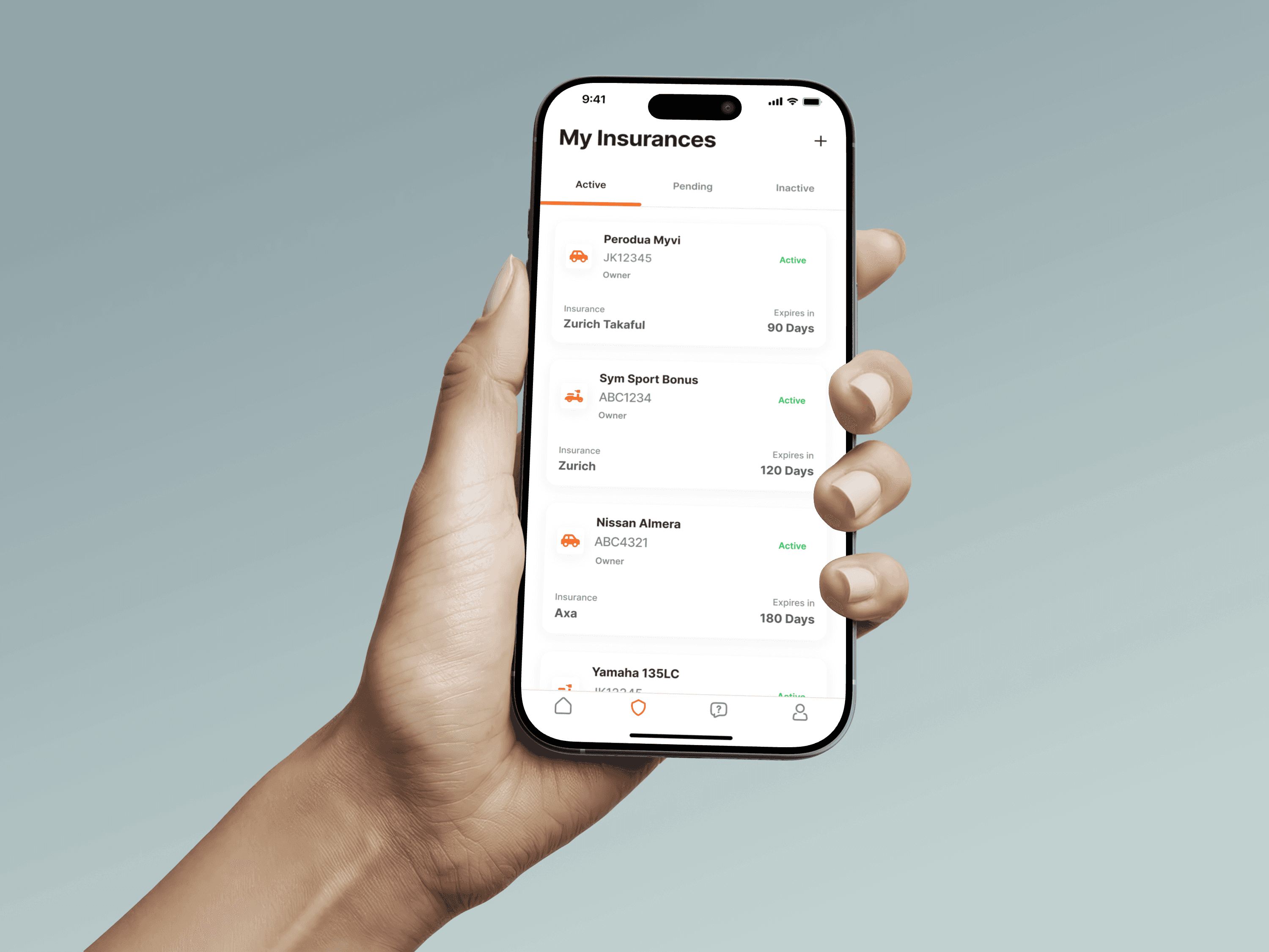
Saved Profiles
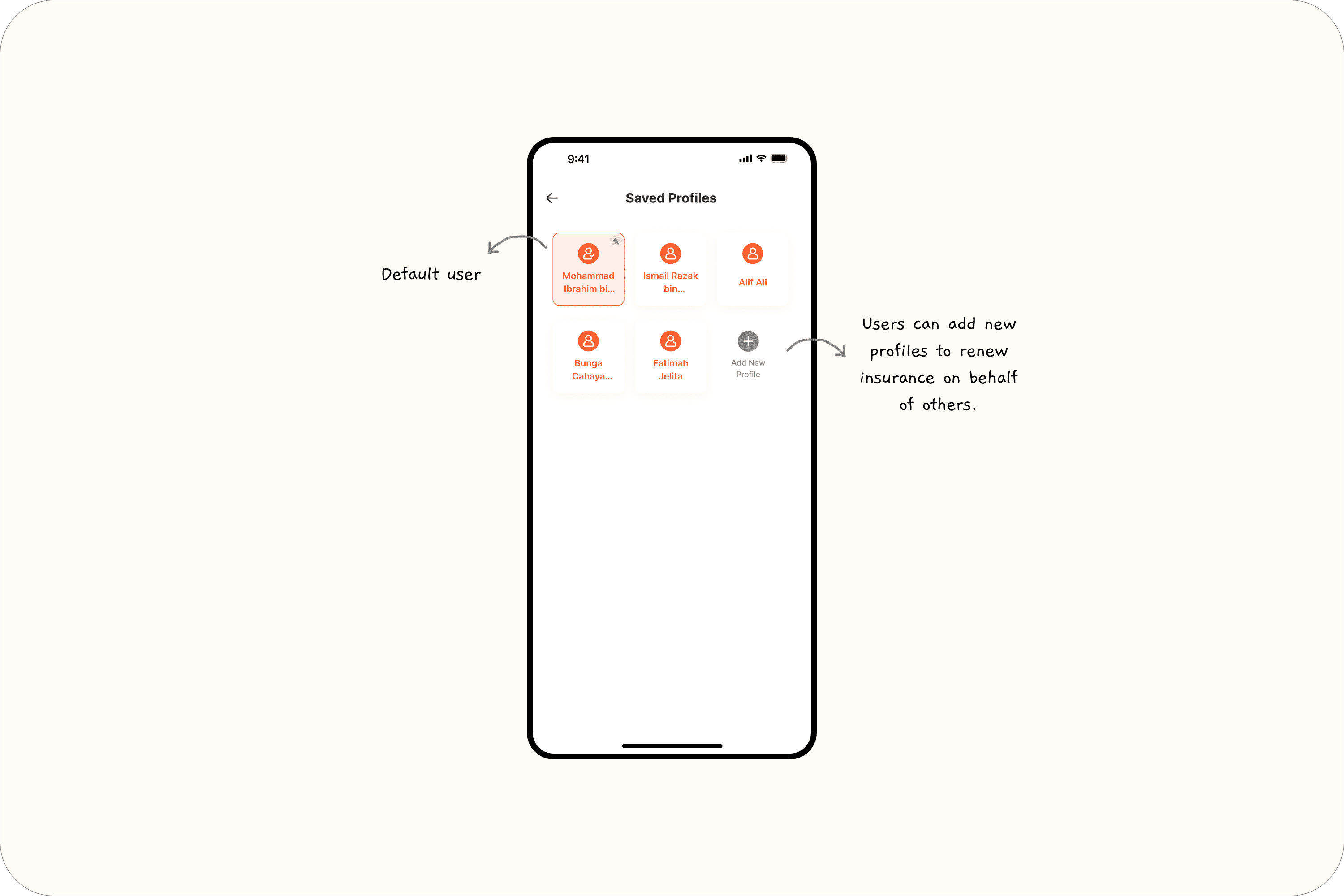
Previously, users were tied to one identity — even when renewing insurance for someone else. We added the ability to store multiple user profiles (e.g., dad, sibling), so the account owner could switch without altering their own identity.
Why it matters: Matched real-world usage and reduced confusion during renewal.
Saved Addresses
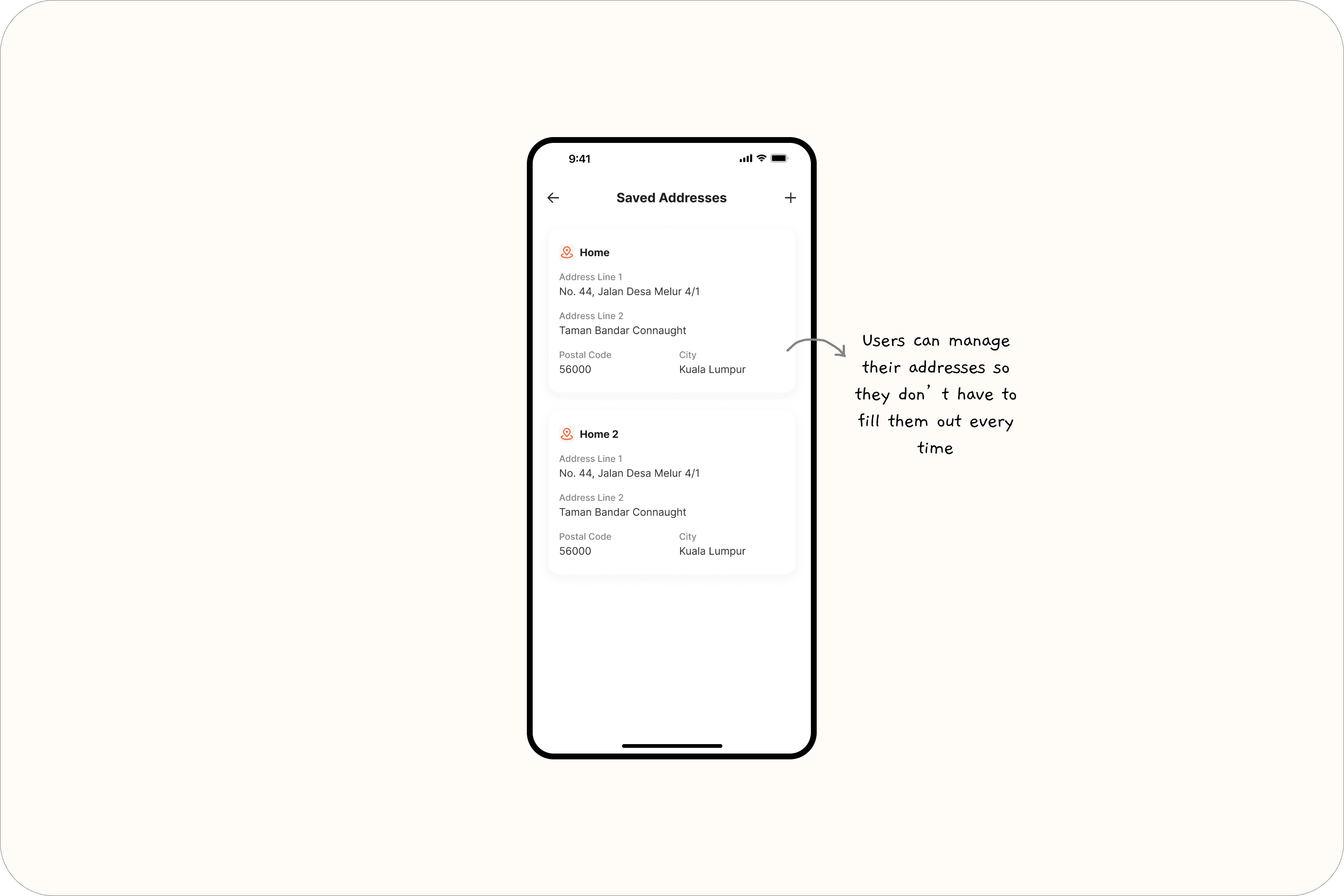
Users had to input their full address from scratch every time they renewed. Now, the app stores their previous addresses and lets them reuse or edit as needed.
Outcome: Reduced input time and frustration, especially for frequent users.
Reflections
As my first full design project after switching careers, this redesign was both challenging and rewarding. Since I didn’t have a design team to bounce ideas off, I had to explore and problem-solve on my own, from wireframes to flow decisions. Thankfully, I had guidance from my product manager and senior, which helped me stay on track and translate their input into thoughtful, user-centered design.
One of the biggest things I learned is how much impact small changes can have. Removing friction, shortening flows, or simply reordering steps can make a huge difference in how users feel. I started to think less like a designer trying to make something "work," and more like a user trying to get something done. That mindset shift really shaped my approach.
I also gained hands-on experience in handing off designs to developers. It taught me the importance of clarity (not just in visuals) but in how I communicate design decisions. Another key learning was how simplicity often leads to better usability. A focused screen with clear direction tends to feel more intuitive, and offering just the right amount of choice (not too much) helps users move forward with confidence.