Designing iLyF’s first responsive web platform for seamless insurance renewal
Redesigned a static landing page into a responsive, end-to-end renewal experience that expanded access beyond mobile.
Web Design
Product Design
UI/UX
Context
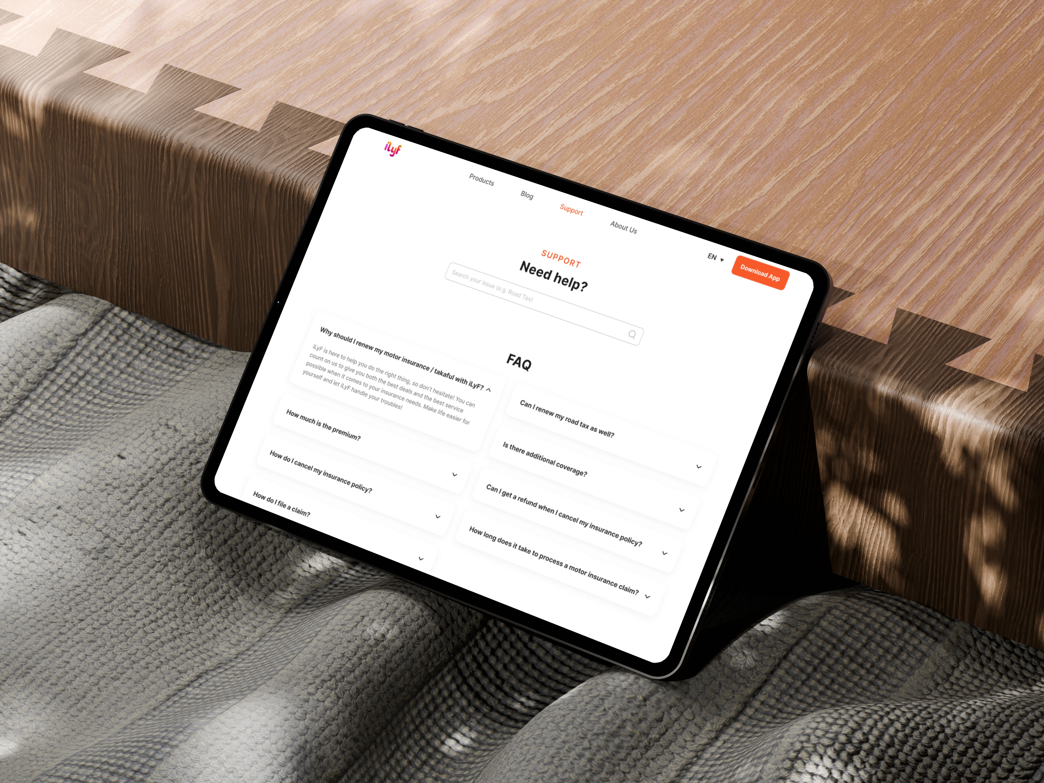
iLyF is an insurance platform that originally operated entirely through its mobile app. At the time, the website served only as a marketing page, with no ability to complete transactions. This project focused on building the platform’s first-ever functional web experience for vehicle insurance renewal, helping the company reach more users and support cross-platform access. My role was to design the full renewal journey and homepage, ensuring the new web experience felt aligned with the mobile app while being fully responsive and intuitive on all screen sizes.
Role: Product Designer
Team: 1 Product Manager, 3 Developers, 1 QA/QC
Tools: Figma, Adobe Illustrator & Photoshop (for assets)
Timeline: April 2023
Result
Launched iLyF’s first functional web renewal platform in May 2023, enabling cross-platform access and capturing 9% of all tracked renewals within 5 months of release.
Expanded reach to users who previously had no access to transactions outside the mobile app, contributing to 1000+ total renewals during the same period.
Unified the user experience and visual identity across platforms, aligning the web interface with the mobile app to strengthen brand trust
Improved accessibility and usability by adapting mobile-first patterns into a scalable web layout, helping users complete long forms more easily
Laid the foundation for future features, like travel insurance and marketing campaigns, by building the web with scalability in mind
Design Process
🔍 Discover & Define
At that time, iLyF’s website was static. It had no interaction, no form handling, and no way to complete a renewal. All user actions still had to happen inside the mobile app. This created friction for users who preferred using a web browser or wanted to manage their insurance from a larger screen.
After reviewing business goals, support team insights, and platform usage trends, we defined a key opportunity: how might we turn iLyF’s website into a fully responsive insurance platform that works across devices?
Together with the team, we established four clear goals:
Allow users to complete the full insurance renewal flow directly on the web
Design a responsive layout optimized for desktop, tablet, and mobile
Maintain visual and functional consistency with the mobile app
Keep the input process clear, focused, and user-friendly
💡 Ideate & Explore
I began by studying the mobile app’s existing UX patterns, then explored how they could translate across various screen sizes. I wireframed three responsive breakpoints (desktop, tablet, and mobile) to ensure the layout worked smoothly without duplicating effort for each platform.
To deepen the direction, I conducted a competitive analysis of five direct and two indirect competitors. I examined their strengths and weaknesses to identify usability gaps, amplify successful patterns, and avoid common pain points. Especially around information hierarchy, quote flows, and form interactions.
The design also needed to serve as a scalable base for future features. I mapped out modular content sections for the homepage and flexible form components for the renewal flow, keeping in mind both usability and long-term maintainability.
🎨 Design & Iterate
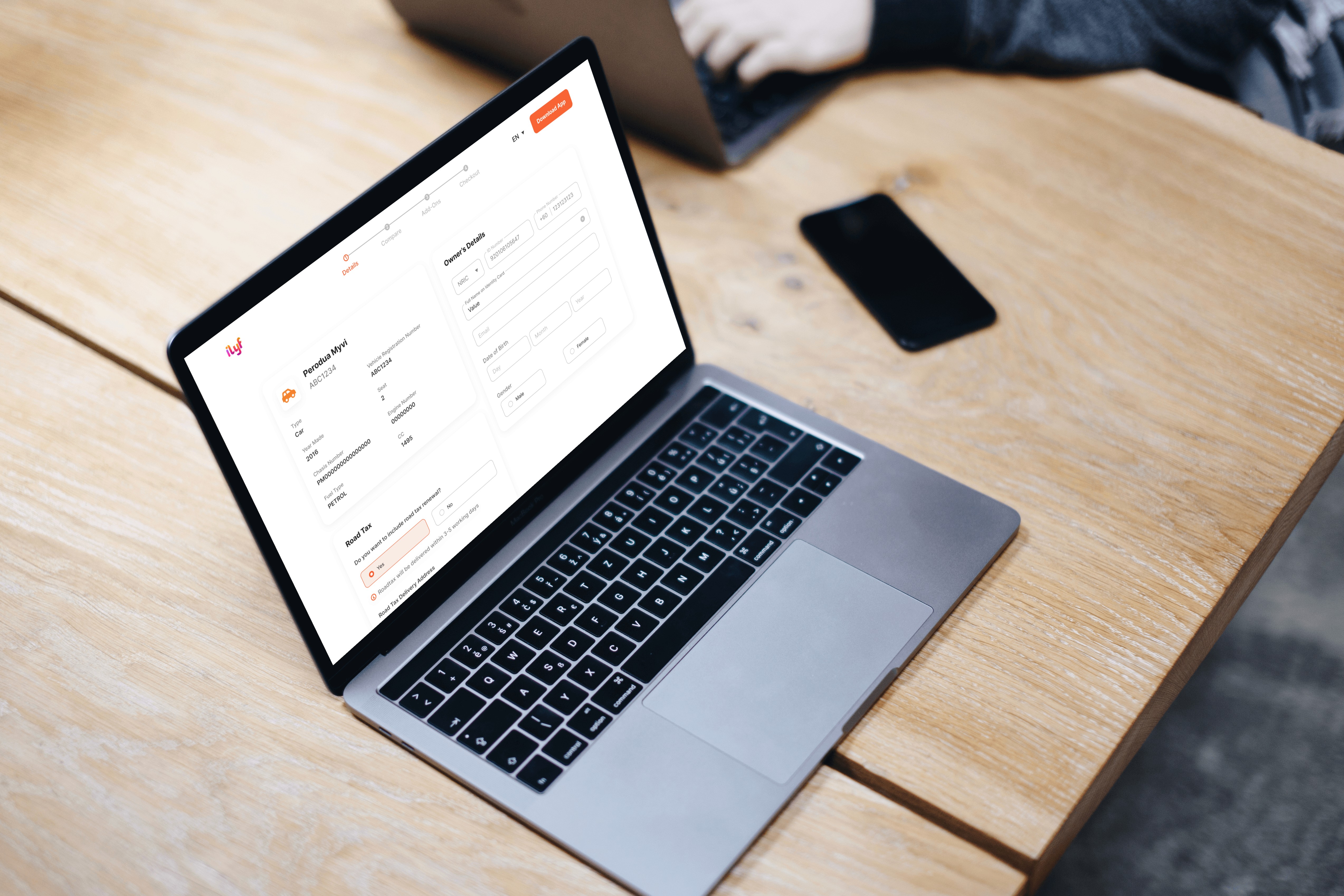
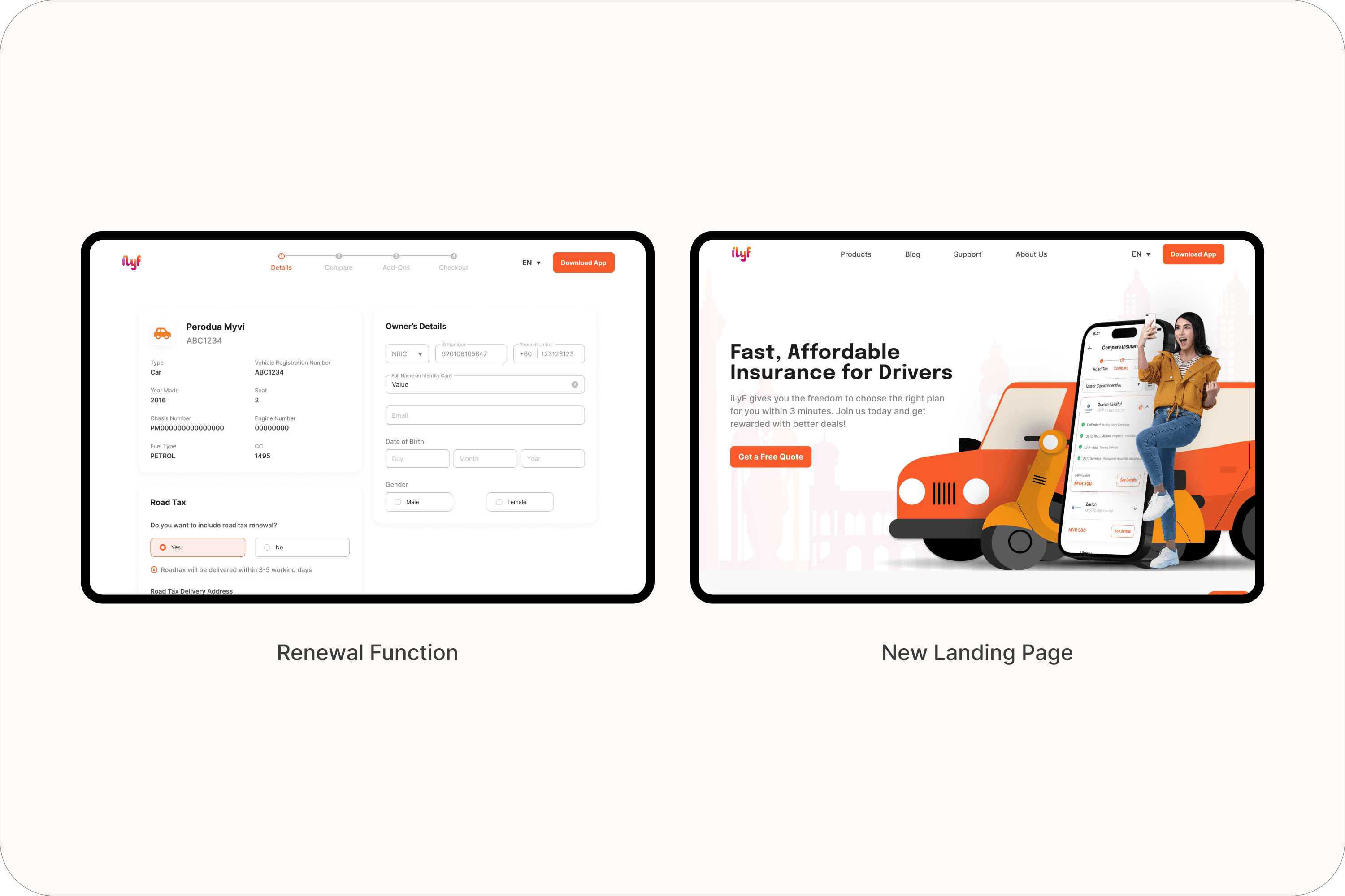
Renewal Flow Design
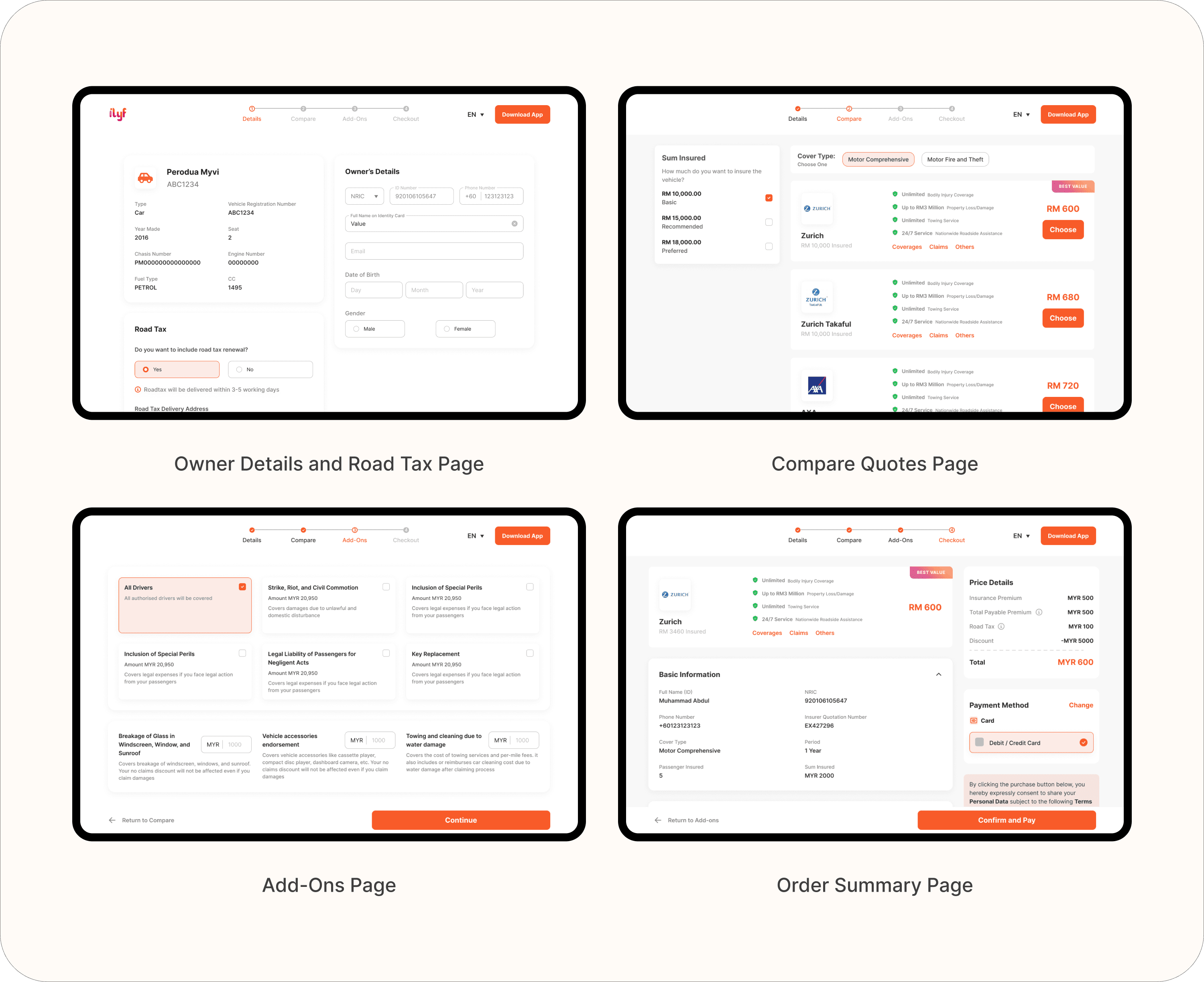
Designed the entire renewal journey on web to mirror and complement the mobile experience.
Applied UX patterns from mobile to maintain familiarity
Worked closely with developers to define responsive behavior
Used UI Kit v1 for visual consistency
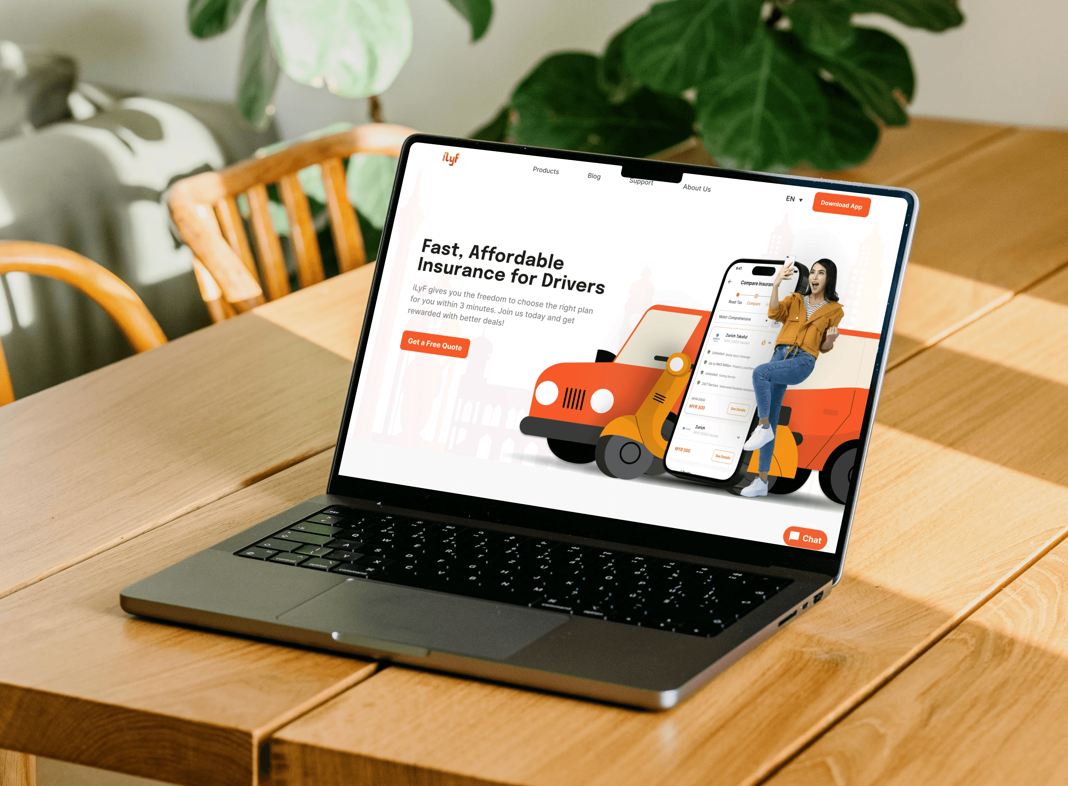
New Landing Page
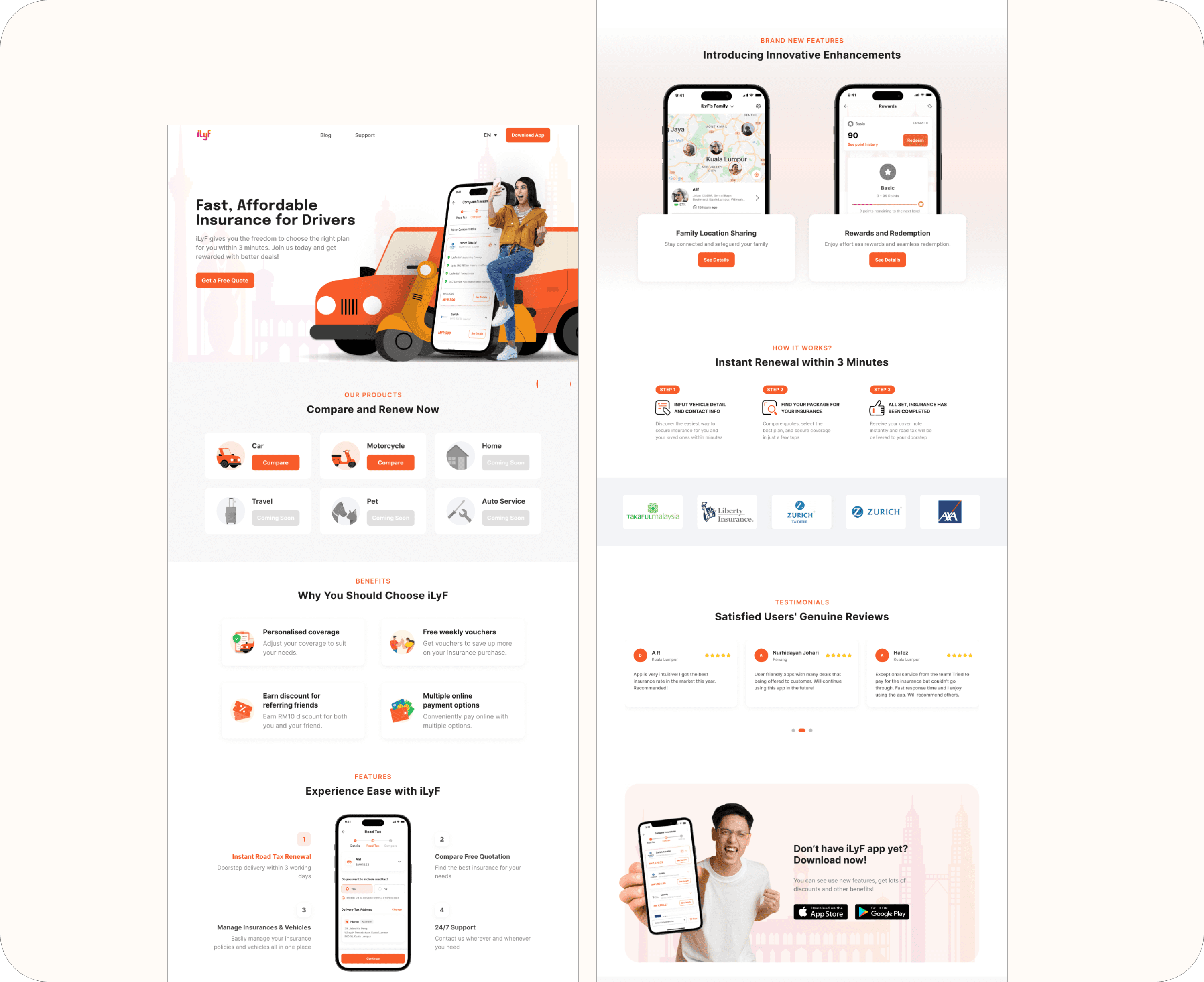
Created a new landing page that aligned with iLyF’s branding and guided users toward renewal with clearer CTAs and product value explanation.
Focused on clarity, content hierarchy, and responsive layout
Designed with flexibility for future marketing campaigns and updates
Reflections
This work taught me how to think responsively from the very beginning, not just designing for one screen, but planning an experience that adapts across devices. Working on desktop, tablet, and mobile layouts gave me a deeper understanding of how content priorities shift depending on the screen size, and how to structure components that can flex without breaking.
I also learned the importance of early alignment with developers when working on responsive systems. Setting layout rules and shared expectations early on made the handoff smoother and helped us avoid misalignment later.
Most importantly, I saw how expanding to the web made iLyF more accessible and inclusive. Designing for flexibility isn’t just a technical challenge, it’s a way to meet users where they are.