Streamlining iLyF’s Web Renewal Flow for Consistency and Conversion
Aligning the renewal flow and static pages with the new design system for a consistent and responsive user experience.
Web Design
Product Design
UI/UX
Context
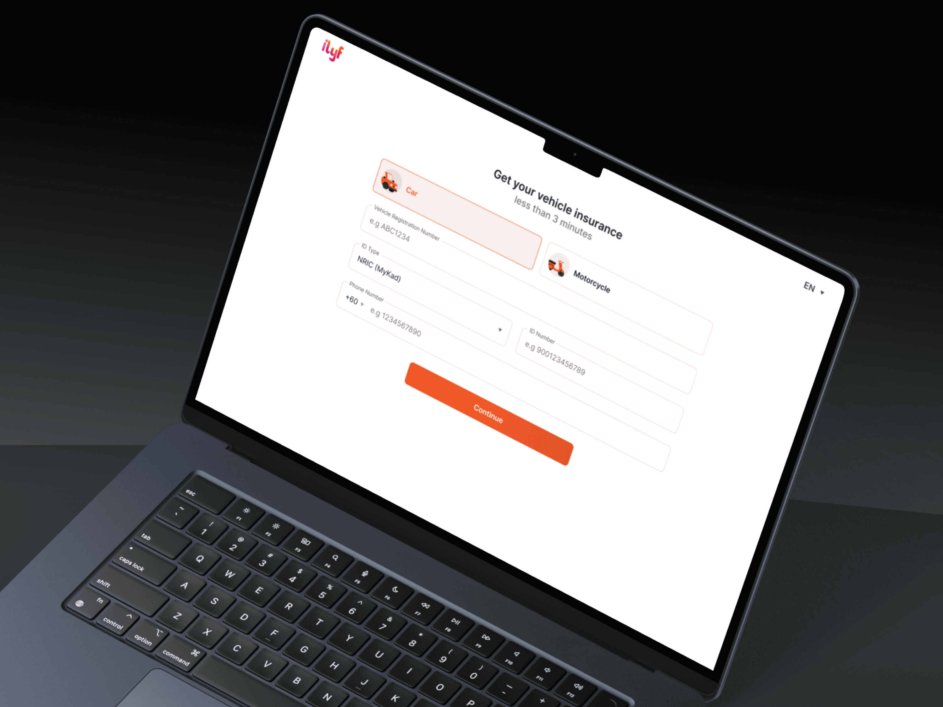
The iLyF vehicle insurance web renewal flow had served users well, but as we moved toward a more unified, mobile-first experience, it became clear that updates were needed to ensure consistency across platforms. While the existing pages were informative, their static structure didn’t fully support responsive behavior or effectively highlight key benefits, especially on smaller screens. In this redesign, I collaborated with the team to restructure the flow and apply iLyF’s updated UI system (v2), aiming to improve clarity, consistency, and usability across devices.
Role: Product Designer
Team: 1 Product Manager, 2 Product Designers, 3 Developers, 1 QA/QC
Tools: Figma, Adobe Illustrator and After Effects (for assets)
Timeline: 2024
Result
Aligned all renewal steps and static pages with iLyF’s new design system
Improved clarity, hierarchy, and readability across screen sizes
Reduced form fatigue by splitting long pages into logical steps
Enabled smoother cross-platform experience between web and mobile
Design Process
🔍 Discover & Define
We reviewed the entire vehicle renewal journey on web and compared it with the recently revamped mobile app. In the PRD, we identified several UX pain points:
Inconsistency in UI and flow logic
Misalignment of benefit content with insurance partners’ documentation
Long forms that led to friction and higher drop-offs
We redefined the problem as a need to standardize the UI, ensure clarity of information, and build a seamless experience across platforms.
💡 Ideate & Explore
We translated the renewed mobile flow into web while respecting web-specific behaviors. Our approach:
Reordered flow steps to follow mobile’s logic
Split forms into progressive steps for better readability
Updated benefit content using verified data from partners
Applied Design System v2, resulting in cleaner layouts, modern spacing, and consistent use of components
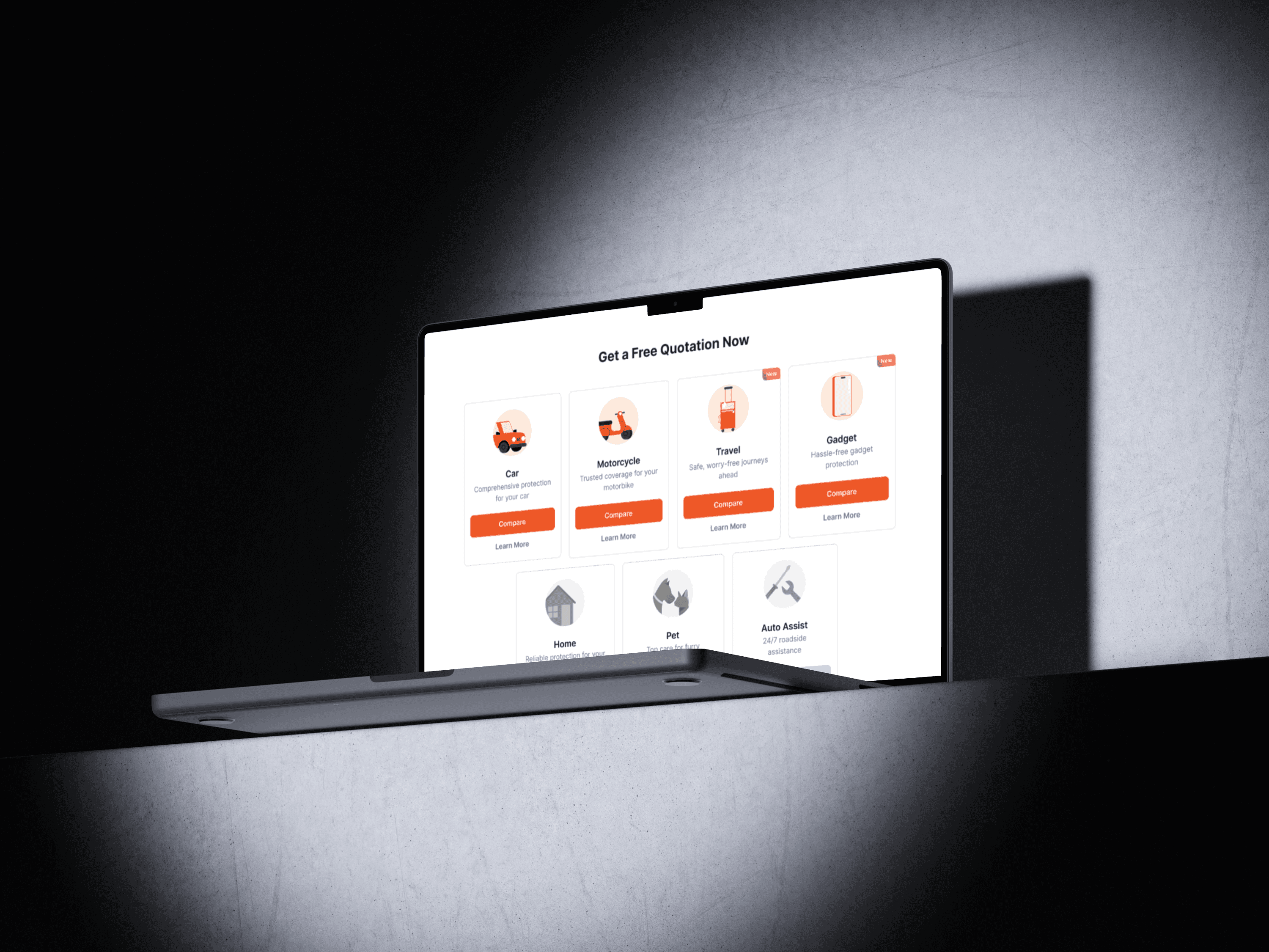
Redesigned all static content pages to match brand and visual language
🎨 Design & Iterate
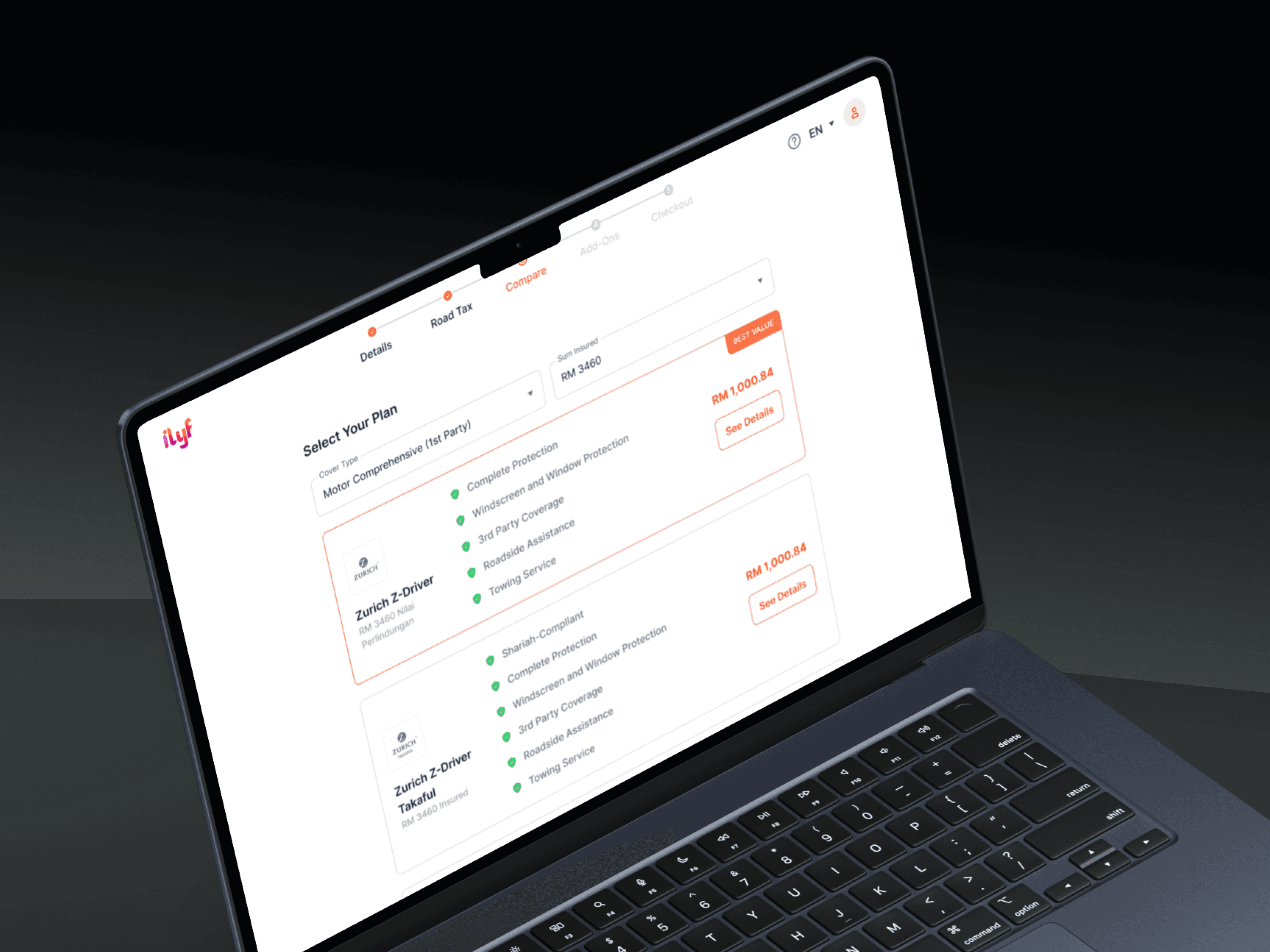
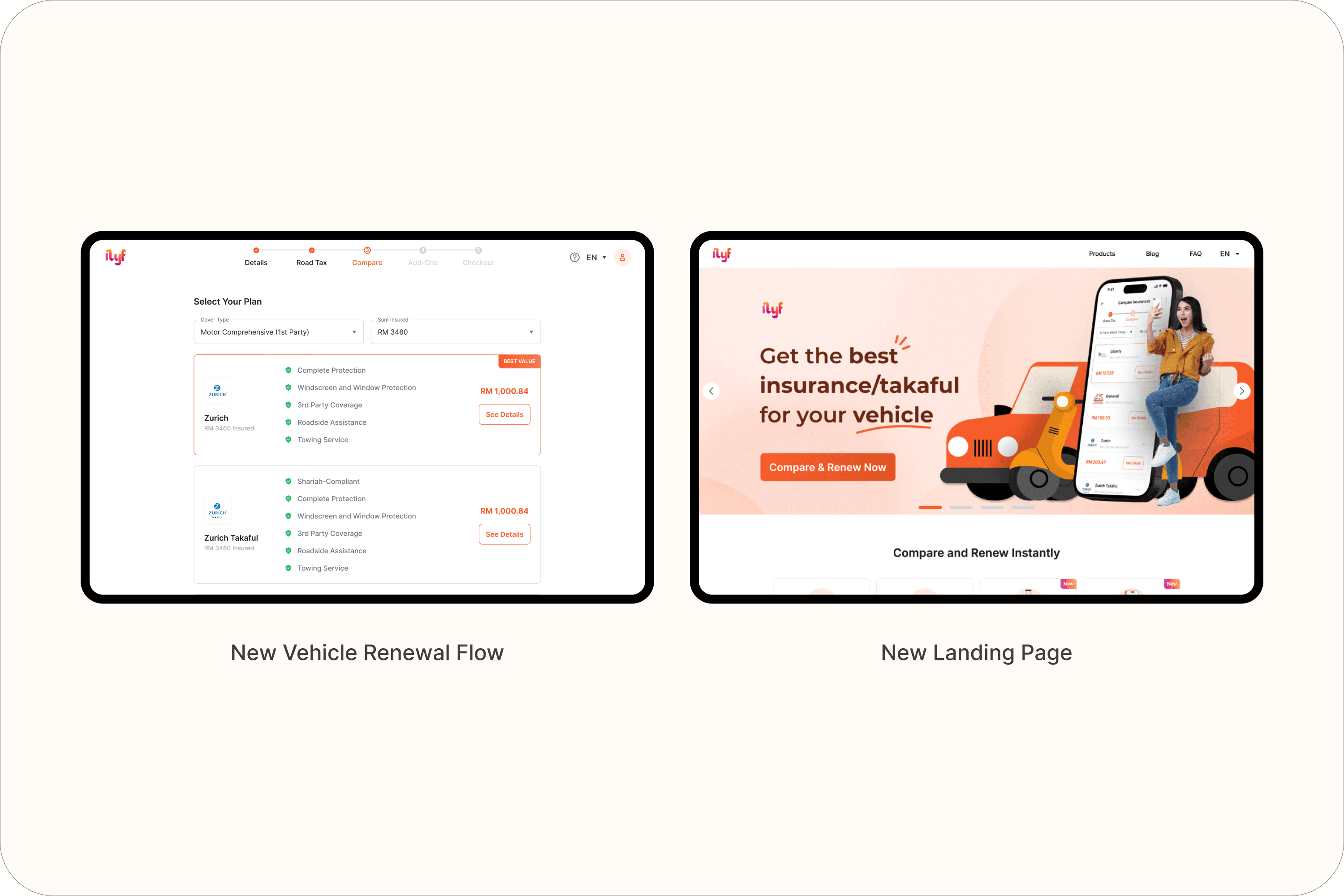
Vehicle Renewal Flow Redesign
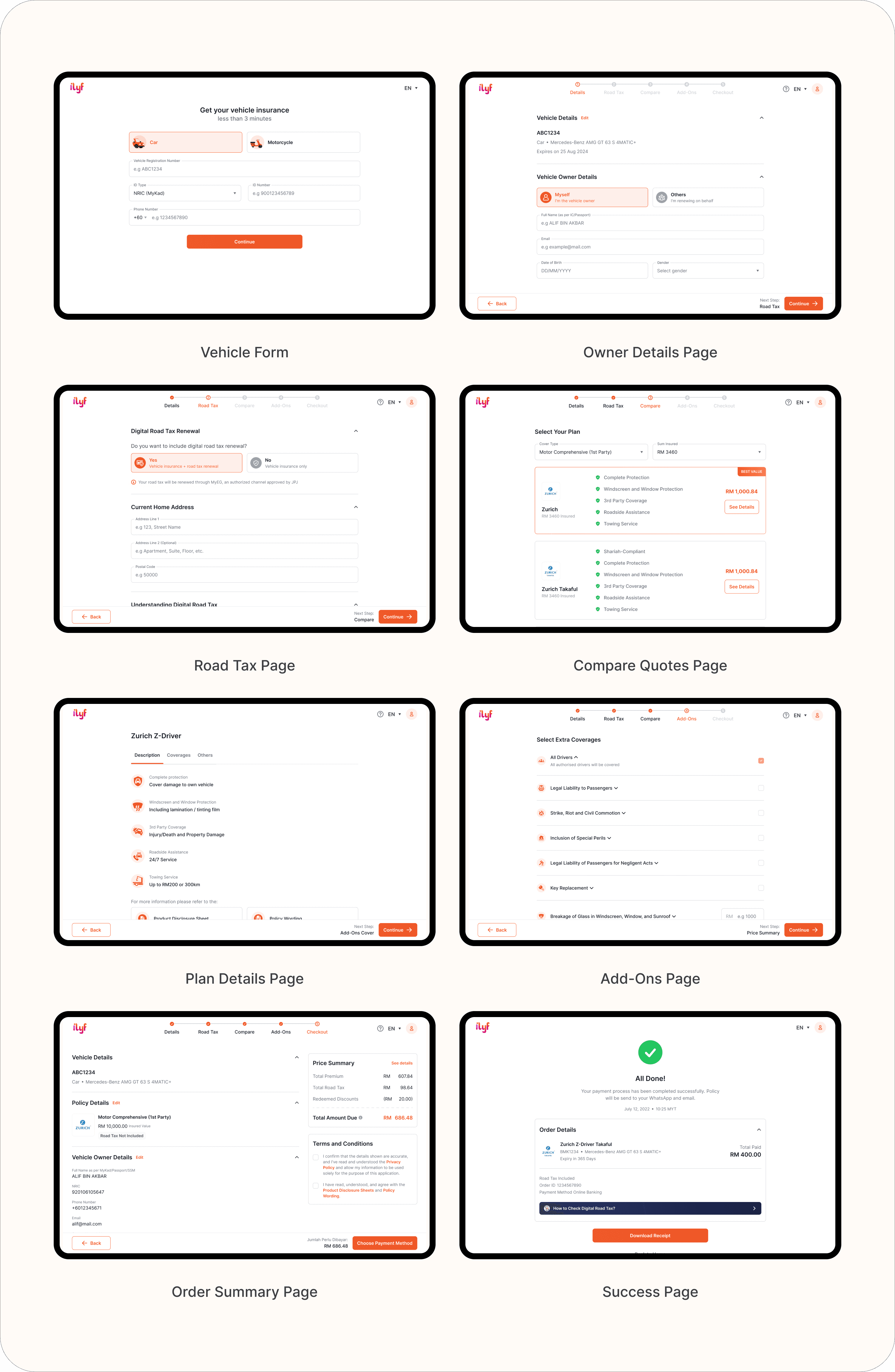
Reordered steps in the flow to match the mobile app
Split longer pages into clearer step-by-step interactions
Ensured consistency with mobile behavior while respecting web layout patterns
Updated responsive design to support mobile access without excessive scrolling
Impact: Improved clarity and usability across screen sizes and ensured smoother UX for returning users switching between platforms.
Static Page Redesign
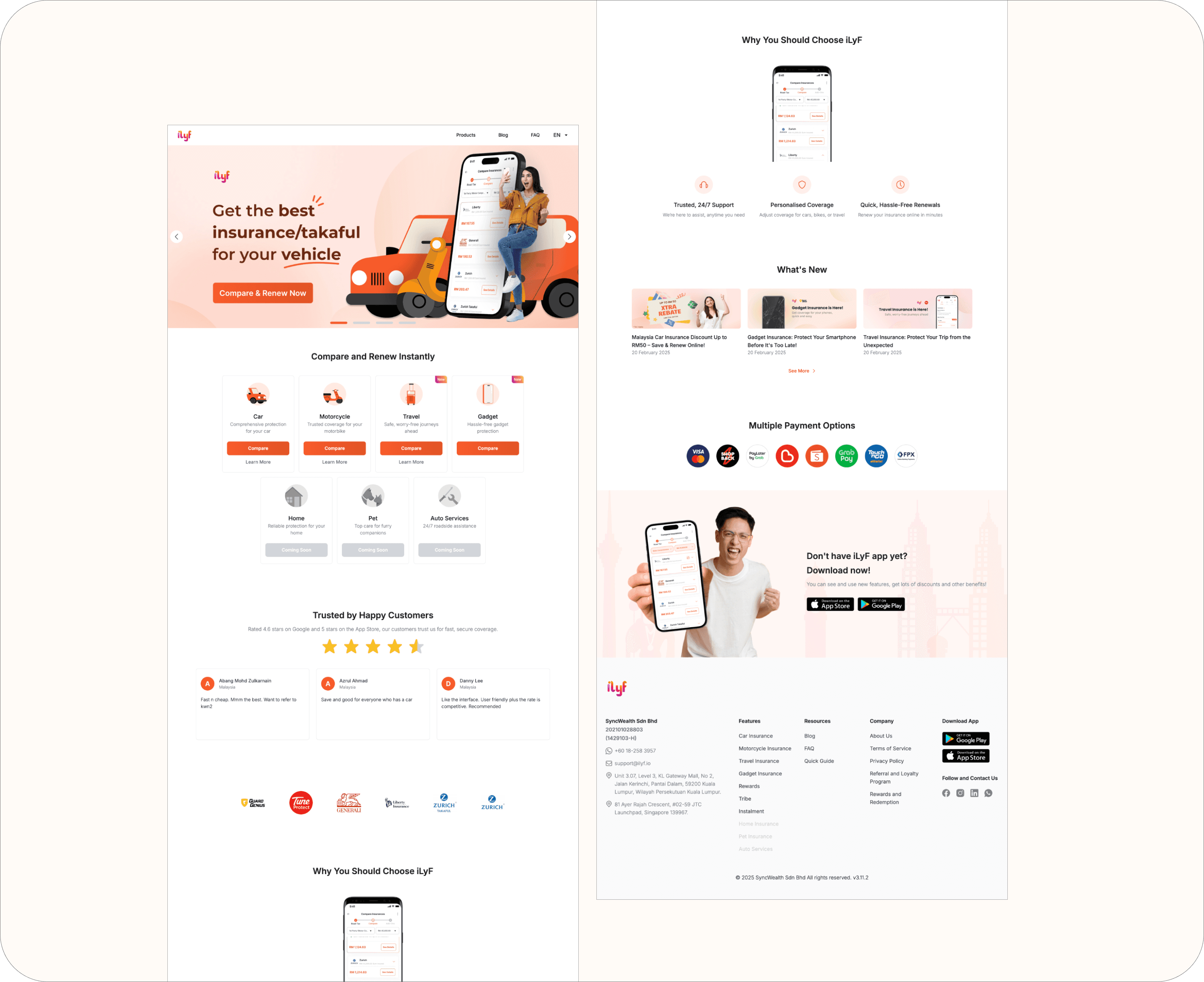
Applied new UI kit v2 to all static pages (FAQ, About, Contact, etc.)
Unified spacing, typography, and component usage
Improved layout structure and visual clarity for future content updates
Impact: Reduced design inconsistencies, improved brand alignment, and simplified maintenance going forward.