Creating a Seamless Purchase Journey for iLyF Travel Insurance
Launching a new insurance product with a user-friendly purchase flow and consistent UI foundation.
Web Design
Product Design
UI/UX
Context
To diversify its offerings beyond vehicle insurance, iLyF launched a new travel insurance product in collaboration with external partners. This project aimed to deliver a complete web-based purchase flow from discovery to checkout, while incorporating the partner’s requirements. We had to ensure the experience remained intuitive and consistent with iLyF’s evolving design standard.
Role: Product Designer
Team: 1 Product Manager, 2 Product Designers, 3 Developers, 1 QA/QC
Tools: Figma, Adobe Illustrator (for assets)
Timeline: 2024
Result
Launched a responsive travel insurance product on web platform
Merged external product flow with internal design system (v2)
Created consistent end-to-end journey from discovery to checkout
Reinforced system-wide UI alignment for new insurance verticals
Strengthened collaboration with external and internal teams
Design Process
🔍 Discover & Define
As iLyF expanded its insurance offerings, we introduced Travel Insurance as a new product within the mobile app. This was our first time designing the experience from the ground up. There was no legacy flow to improve, but we had to ensure clarity and trust from the very first launch.
To better understand what users needed, I partnered with another designer to explore the product flow of our external insurance partner. We mapped out all available features and benefits to define what should be highlighted and how best to present them to users.
From this early discovery, we identified a key challenge:
How might we present travel insurance options in a way that feels simple, trustworthy, and easy to act on?
Together with the team, we established three design goals:
Highlight key features and benefits clearly to help users compare plans
Create a guided selection flow that supports decision-making step by step
Ensure visual consistency using our new design system v2
💡 Ideate & Explore
After aligning on the goals, I collaborated with another designer to translate our findings into flows and wireframes. We began by creating the flows and information architecture then sketching different layout ideas that could present the partner's plan options in a clearer and more intuitive way.
Throughout this phase, we applied iLyF’s updated design system v2, which provided improved spacing rules, clearer typography, and simplified components to help us maintain consistency and clarity across all screens.
🎨 Design & Iterate
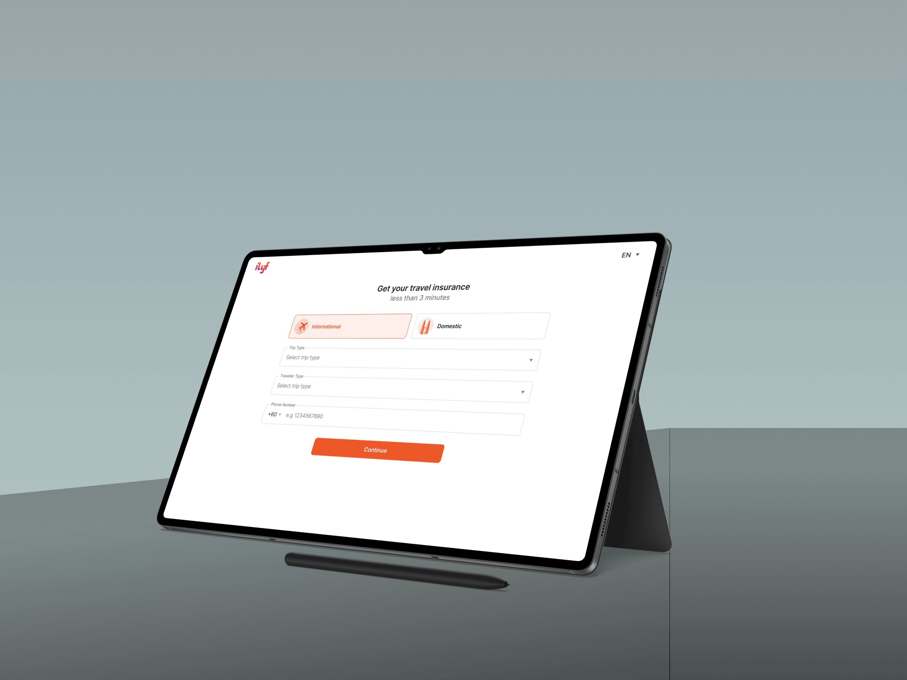
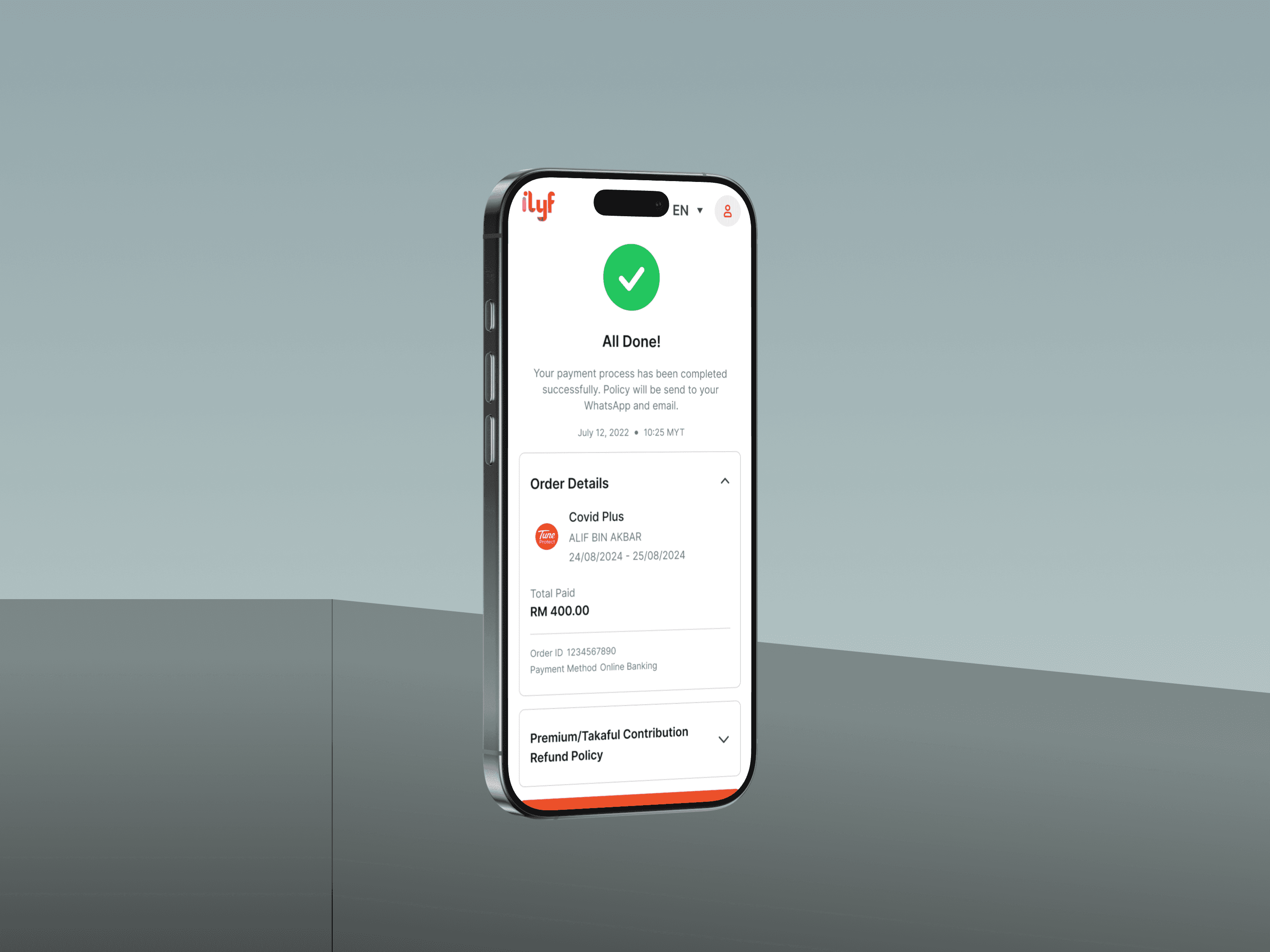
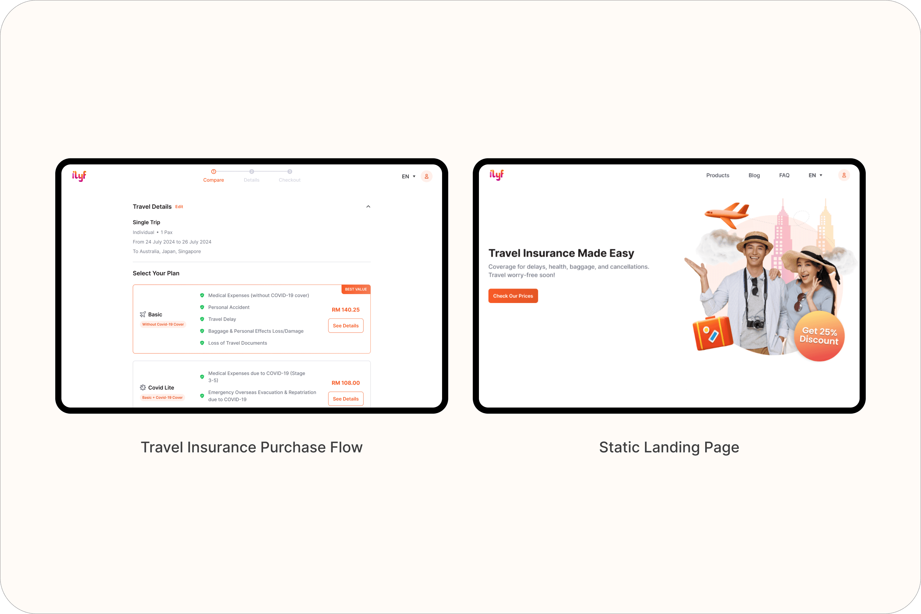
Travel Insurance Purchase Flow
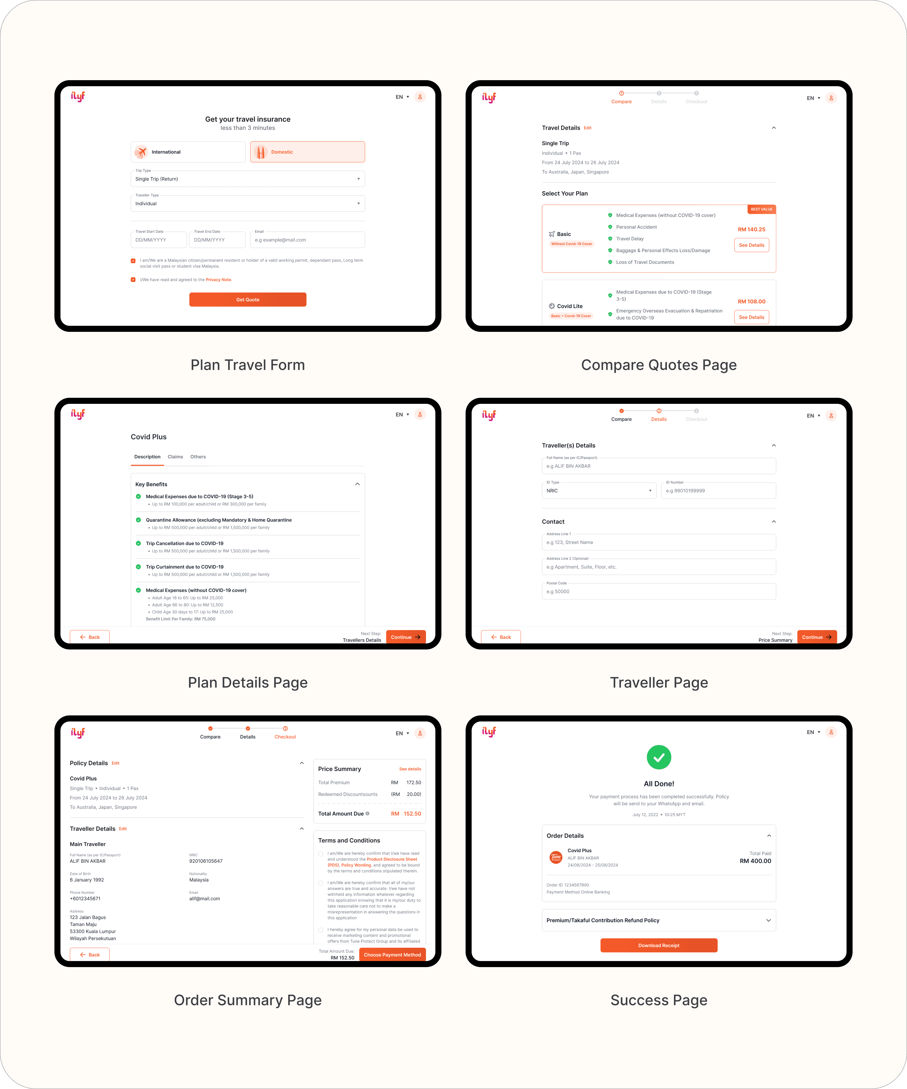
Designed a web flow allowing users to:
Input travel details (destination, date, etc.)
Compare available insurance plans
Fill traveler info
Checkout and complete purchase
Impact: Enabled a new product vertical while maintaining platform-wide visual consistency.
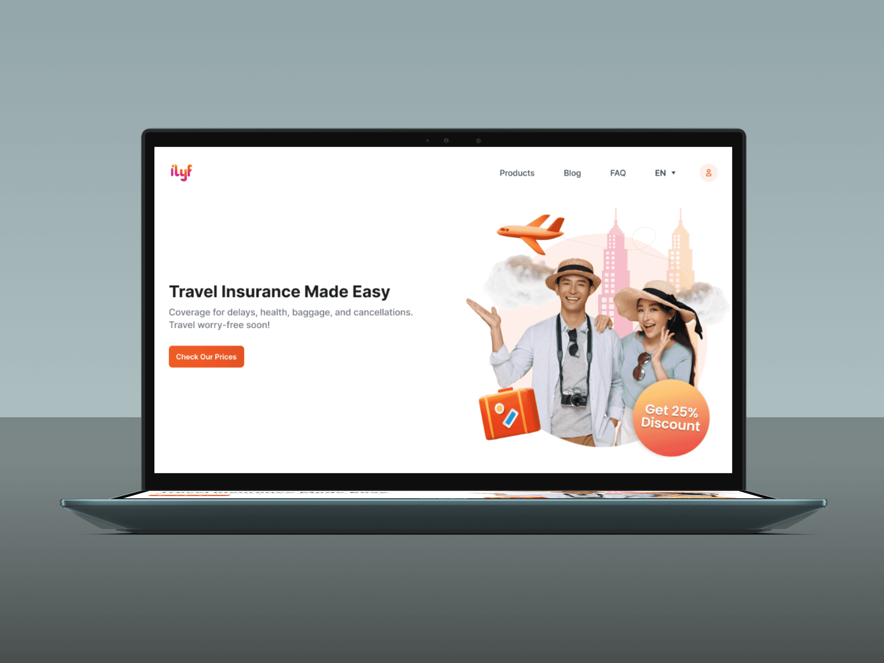
Static Landing Page
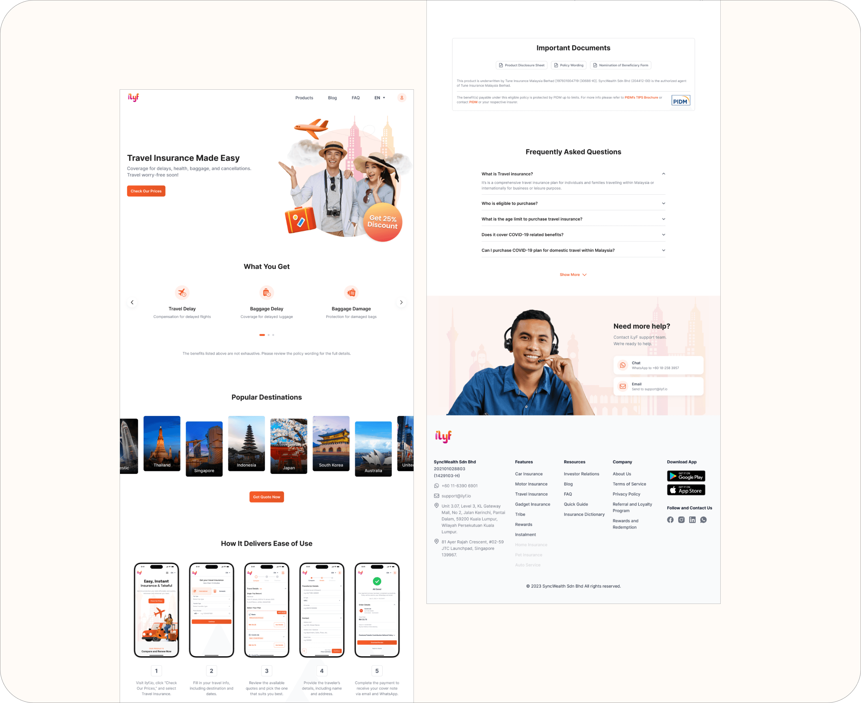
Created an intro-style static page for Travel Insurance:
Triggered via "Learn More" actions
Explained product benefits and coverage in a clean layout
Optimized visual hierarchy and CTA placement
Why it matters: Supported discovery and education for a new product vertical.
Reflections
This project taught me how to align external partner requirements with our internal design standards. I learned to carefully adapt our style guide to meet specific business needs while keeping the experience clear and cohesive. It also strengthened my ability to balance multiple constraints (from product goals to partnership expectations) without compromising usability.