Redesigning iLyF Mobile App v3 to Drive Its Highest Conversion Rate
Improving the return experience and engagement through personalization and loyalty features.
Mobile App Design
Product Design
UI/UX
Context
After launching v2 of the iLyF mobile app, we noticed friction in how returning users resumed their renewal journey. Users often had to repeat the same inputs and had little reason to return after completing a transaction. To address this, our team began working on version 3 with a focus on streamlining renewals and driving engagement through personalization and rewards.
I led the early design work from v3.0 to v3.5, then continued collaborating closely with a new design teammate in v3.6 and v3.7. The flows and improvements shown in this case study reflect a combination of both my solo and collaborative contributions.
Role: Product Designer
Team: 1 Product Manager, 2 Product Designers, 3 Developers, 1 QA/QC
Tools: Figma, Adobe Illustrator, Photoshop & After Effects (for assets)
Timeline: 2022-2024 (version 3.1 till version 3.7)
Result
Streamlined renewal flow from 6 to 2 screens, significantly reducing friction to reach the compare page
Achieved record-breaking renewal growth with 3,300+ completed mobile orders, the highest in product history
Introduced flexible profile handling for users managing vehicles on behalf of others
Launched a reward system that gave users a reason to stay engaged after each renew
Strengthened collaboration with developers and QA to ensure logic handled complex cases
Design Process
🔍 Discover & Define
After launching v2 of the iLyF mobile app, we noticed opportunities to better support returning users. While the overall flow was functional and visually improved, users still had to re-enter the same information when renewing their insurance. Once a transaction was completed, there was little reason for them to return to the app.
At the same time, vehicle profiles weren’t reliably reused, and the experience lacked personalized cues or rewards that could drive repeat behavior. These gaps became more apparent as the user base grew and more users began to return for their second or third renewal.
After reviewing user feedback, Mixpanel data, and business goals, we identified a core opportunity:
How might we make the renewal experience more seamless and rewarding for returning users?
Together with the team, we established three key goals:
Streamline the renewal process by reusing saved user and vehicle data
Improve accuracy and clarity in vehicle profile handling
Introduce a personalized rewards system to encourage long-term engagement
💡 Ideate & Explore
In the early phase (v3.1–v3.5), I worked independently to explore solutions based on feedback gathered by our lead. I proposed several design options to address the core usability and engagement issues, then aligned the direction through discussions with my PM and developers.
Starting in v3.6, I collaborated closely with another designer. We co-analyzed user problems, sketched multiple variations together, and combined our perspectives to refine the best solution. This shift from solo exploration to team ideation helped us push creative boundaries while keeping feasibility in check.
🎨 Design & Iterate
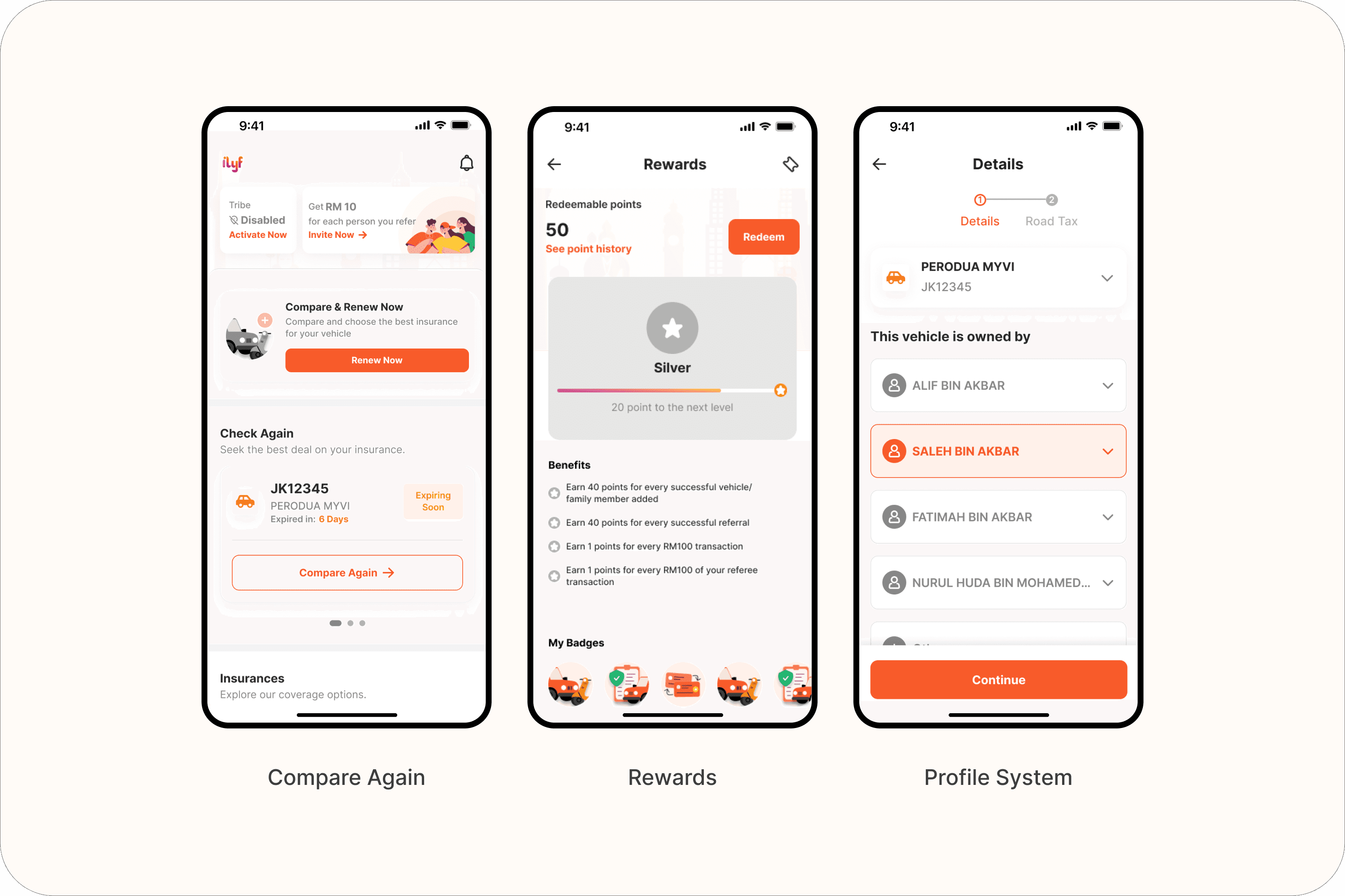
Compare Again + Ready to Renew Section
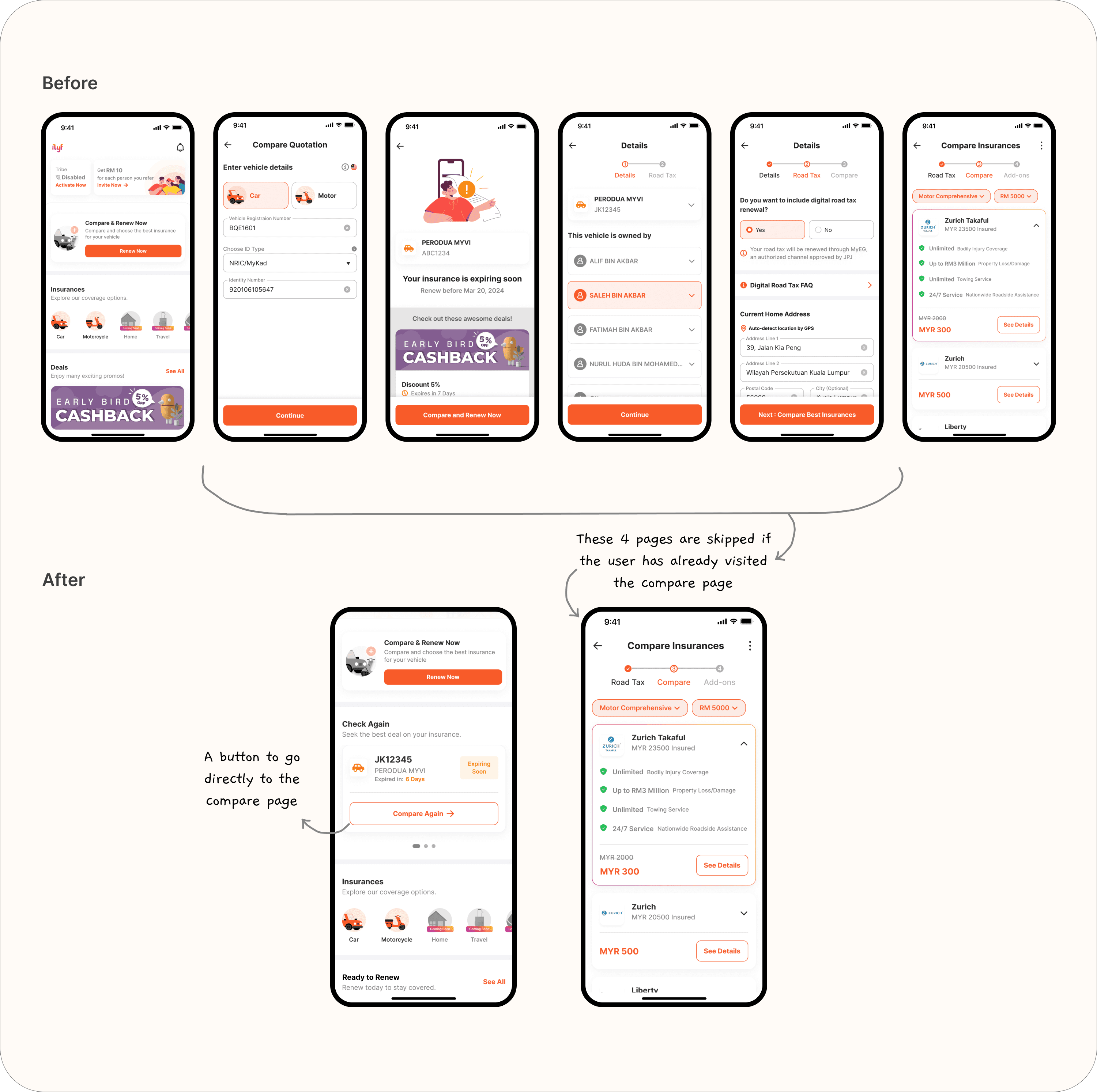
Returning users who previously reached the comparison step but didn't complete the process could now resume with one click.
Skipped redundant vehicle form inputs
Provided clear re-entry points for returning users
Designed a “Check Again” section with direct action buttons
Impact: Reduced friction for users who paused renewal and improved re-engagement potential.
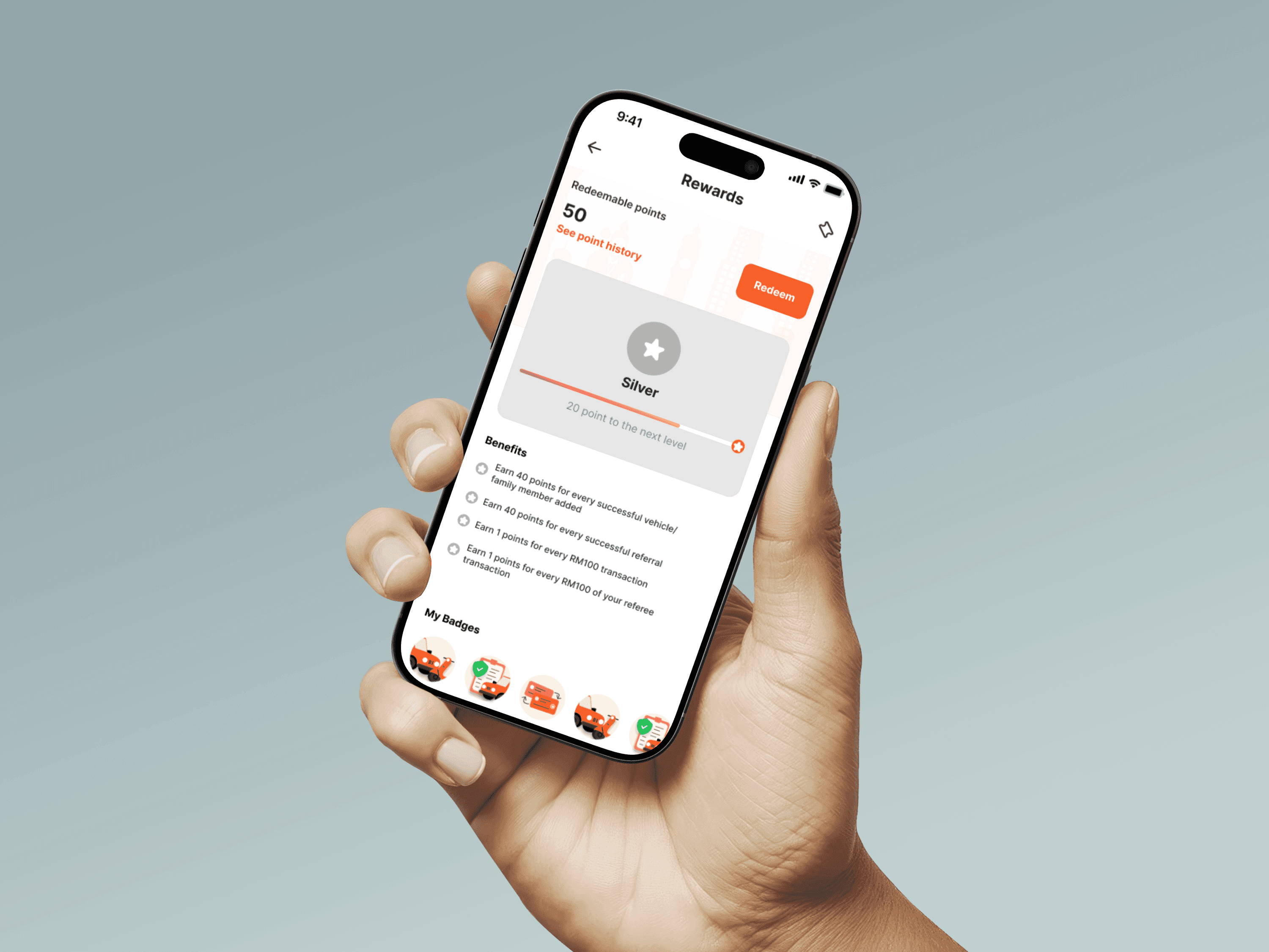
Rewards System & Voucher Integration
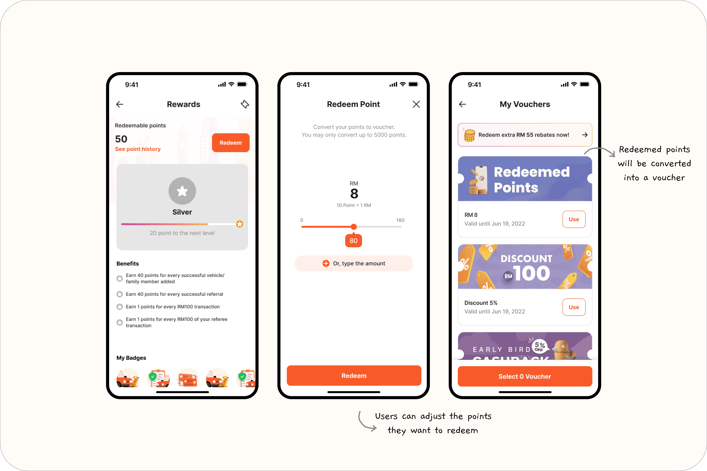
Introduced a loyalty program with points, levels, and redeemable vouchers.
Designed rewards dashboard UI and voucher flow
Collaborated with the product team to map user journeys
Visual style aligned with gamification tone but kept clean and brand-consistent
Impact: Added ongoing engagement layer, gave users tangible value for staying in the ecosystem.
Improved Profiling System
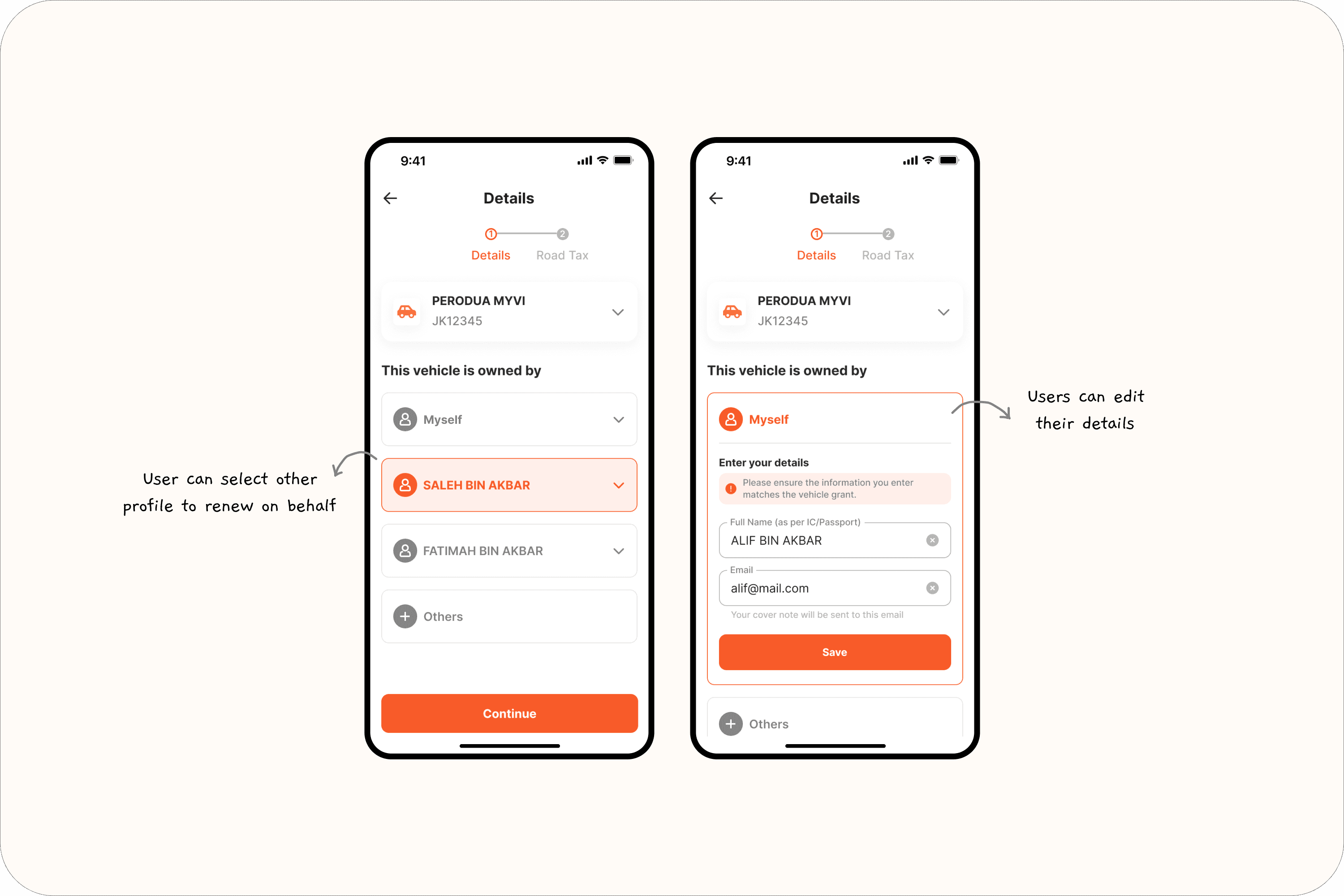
Expanded v2’s saved profile logic to support ownership selection.
Designed a selection mechanism so users could specify who owns the vehicle (themselves or others)
Helped clarify user context during renewal without altering account identity
Worked closely with backend and QA to handle logic edge cases
Impact: Better support for users renewing on behalf of others (e.g., family), improving UX and backend alignment.
Reflections
This was my first end-to-end experience expanding a product beyond its core transaction. It pushed me to think more long-term, not just about usability, but about habit-forming features and user retention. Collaborating with another designer after v3.5 also gave me a chance to learn how to align faster and divide ownership clearly. If I were to revisit this module, I’d love to explore more personalized content on the home screen based on user behavior.