Building a Cross-Platform Design System for iLyF
A cross-platform design system built for scale, clarity, and faster collaboration.
Design System
Product Design
Visual Design
Context
As iLyF’s product offerings expanded across mobile and web, we began to face challenges with design consistency, redundant effort, and a growing need for scalable collaboration. Without a unified design system, each new feature required repeated decisions, leading to visual inconsistencies and inefficiencies in design–dev handoff. We needed a unified design system to scale efficiently, improve visual consistency, and accelerate cross-functional collaboration.
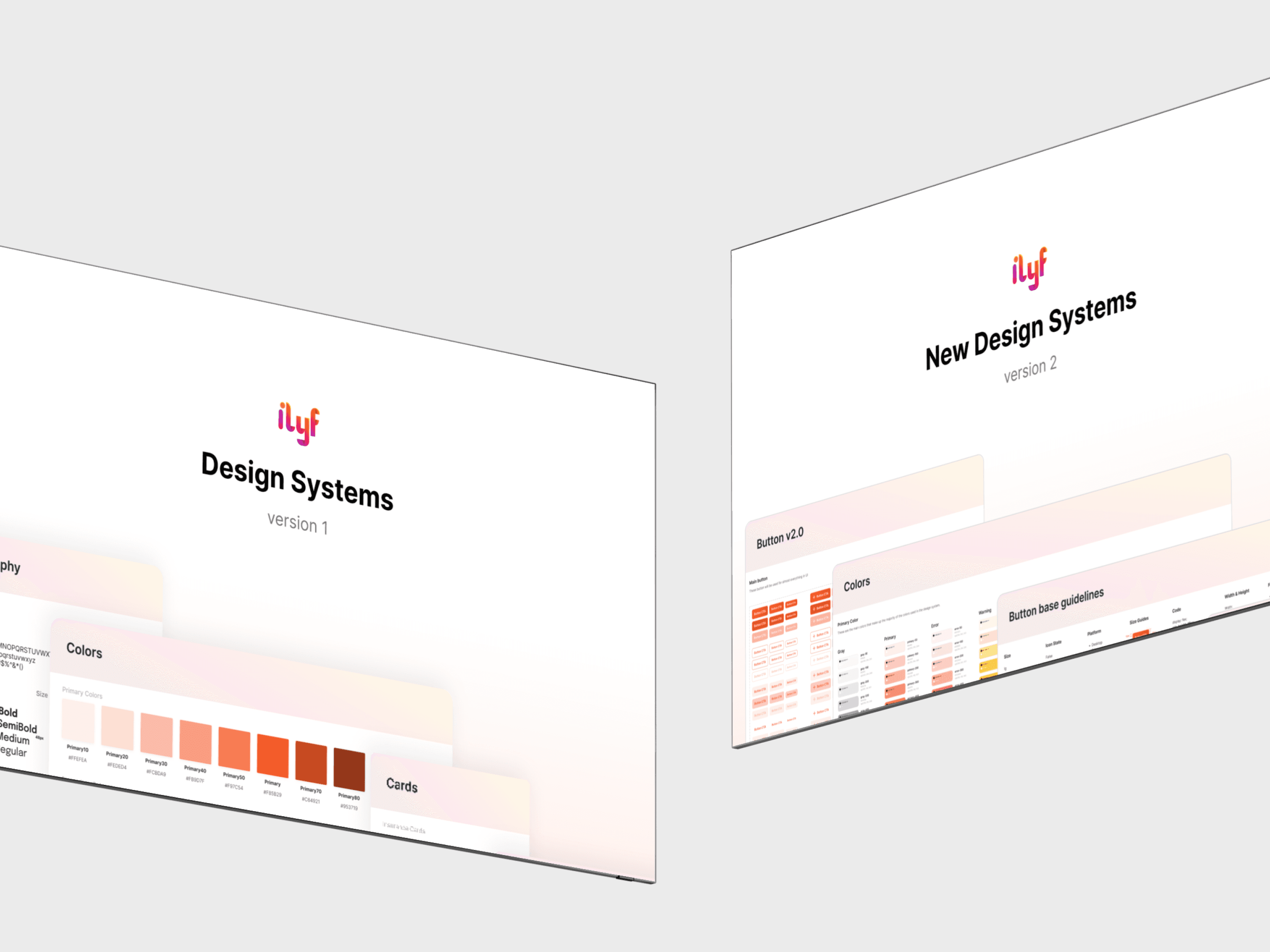
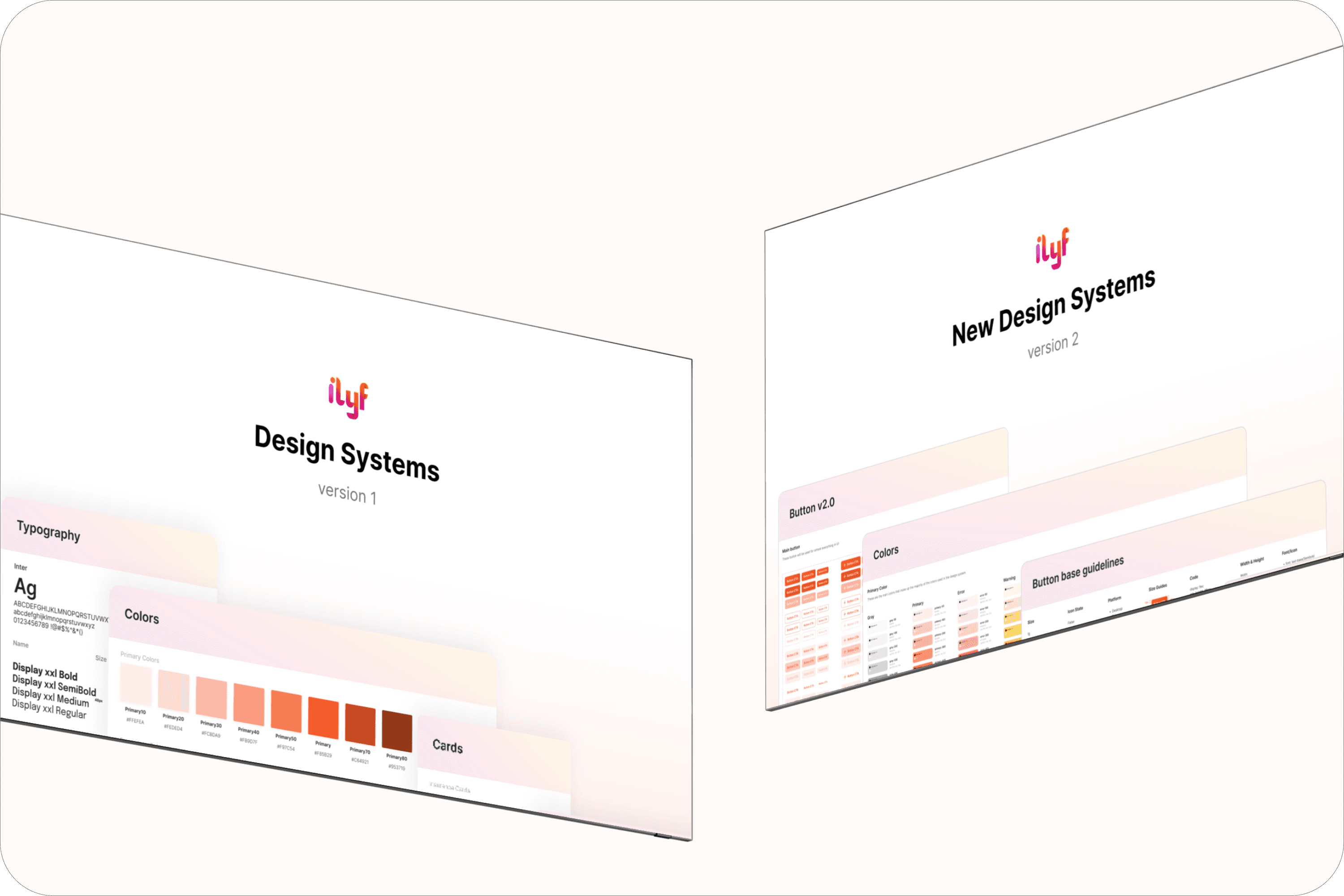
This initiative evolved over two phases:
v1 focused on establishing core foundations
v2 refined the cleaner visuals and structure for better scalability
I collaborated closely with another designer (on v2), our PM, and dev team to bring both versions to life.
Role: Product Designer
Team: 1 Product Manager, 2 Product Designers, 3 Developers, 1 QA/QC
Tools: Figma
Timeline: 2022 & 2024
Result
Improved design consistency across mobile and web
Reduced repetitive work through reusable components
Enabled faster development & easier QA checks
Became the foundation for all future product design
Supported cross-platform scalability with clear visual standards
Design Process
🔍 Discover & Define
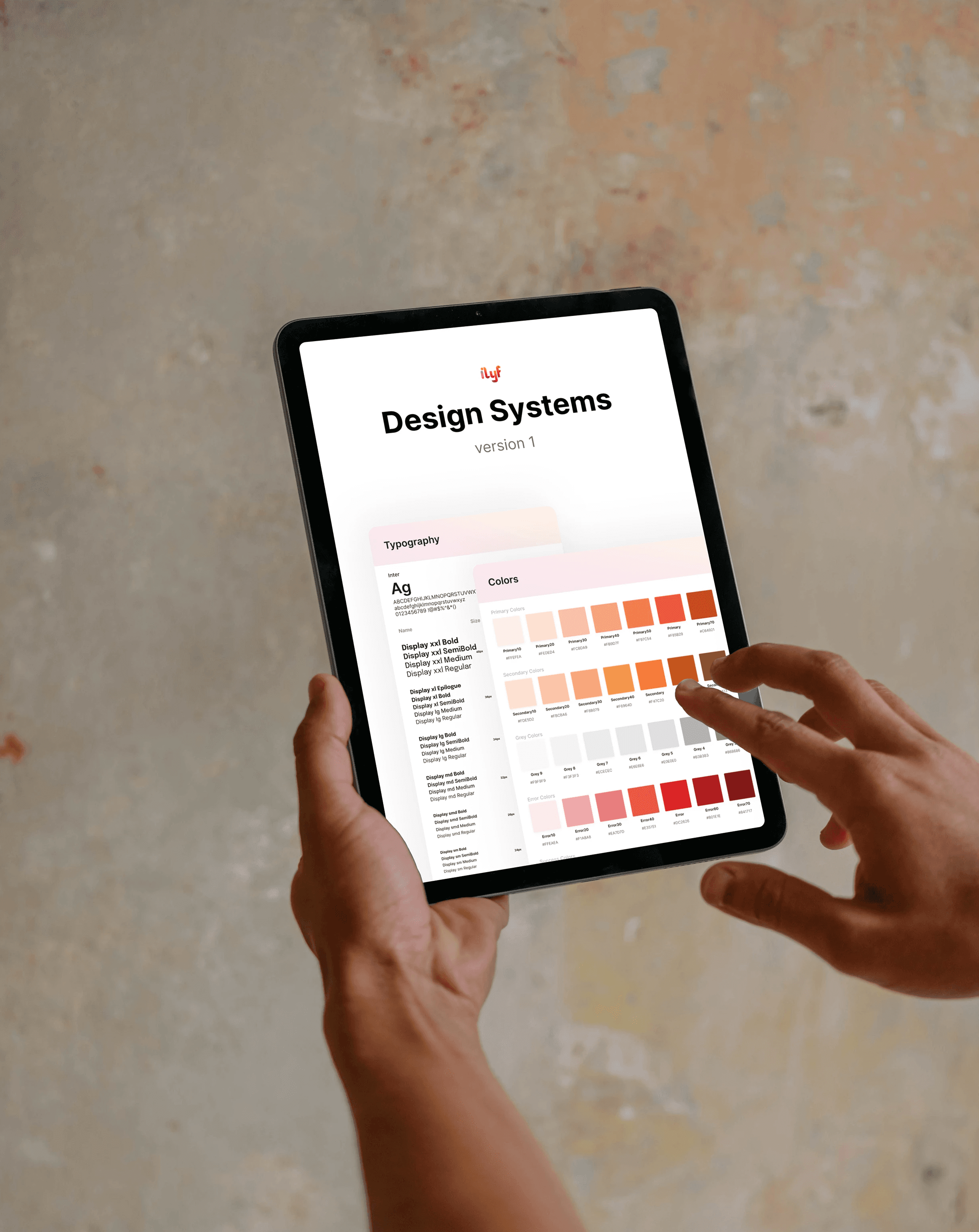
The first version of iLyF’s design system (v1) was born out of necessity. When I began designing the mobile app v2, I realized we need consistent styles and components. Rather than start from scratch each time, I initiated a foundational system to support high-fidelity designs across screens.
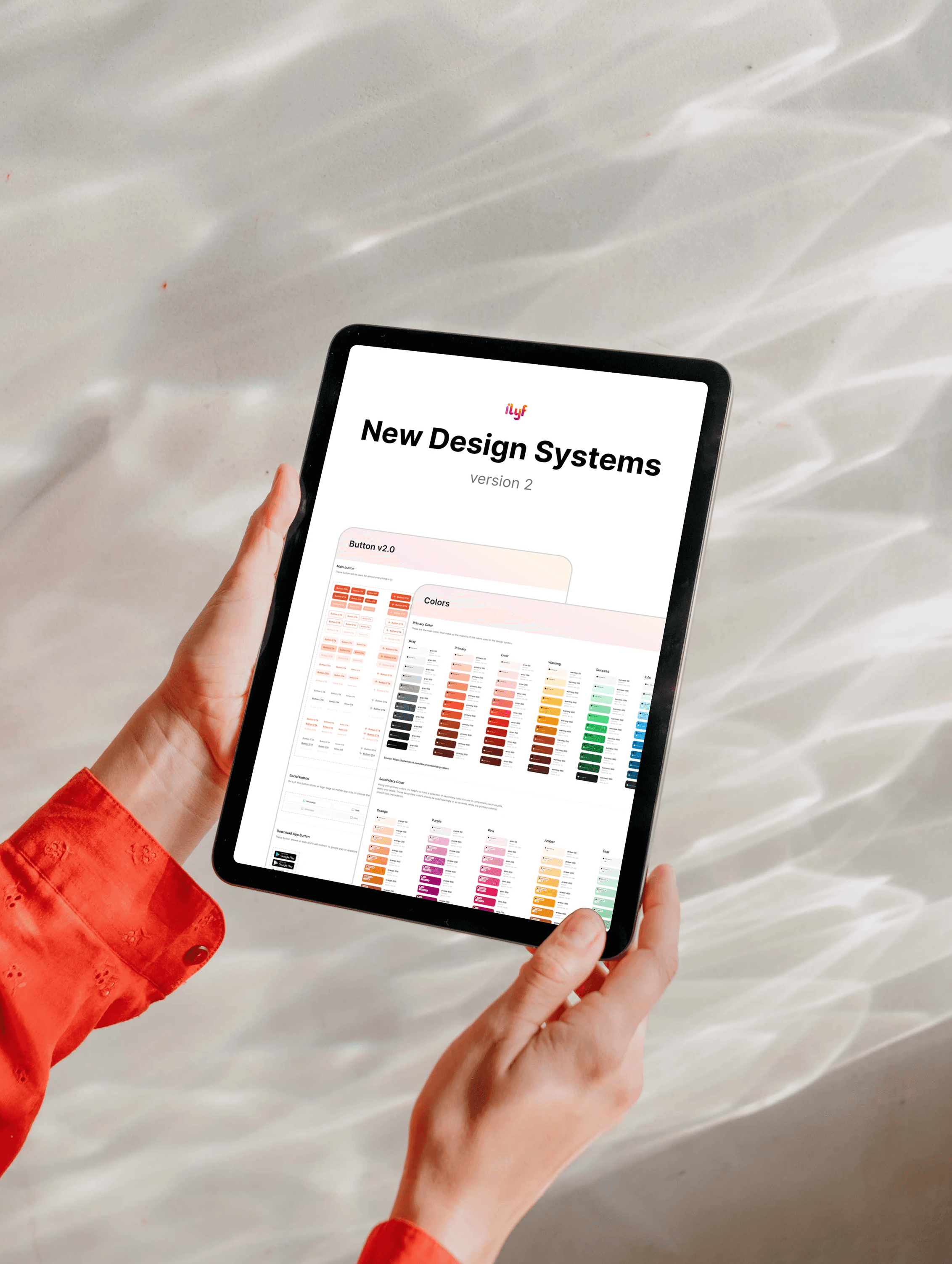
In version 2, I collaborated with another designer to redesign the system based on feedback from my lead, who emphasized the need for a cleaner, more lightweight visual approach. We focused on improving content density, readability, and scannability.
💡 Ideate & Explore
As the sole designer in the early phase, I created the foundation for iLyF’s design system to support the mobile app redesign. I started with creating foundational components, colors, typography, and basic patterns. I built based on existing product screens and used patterns that felt consistent and clean at the time.
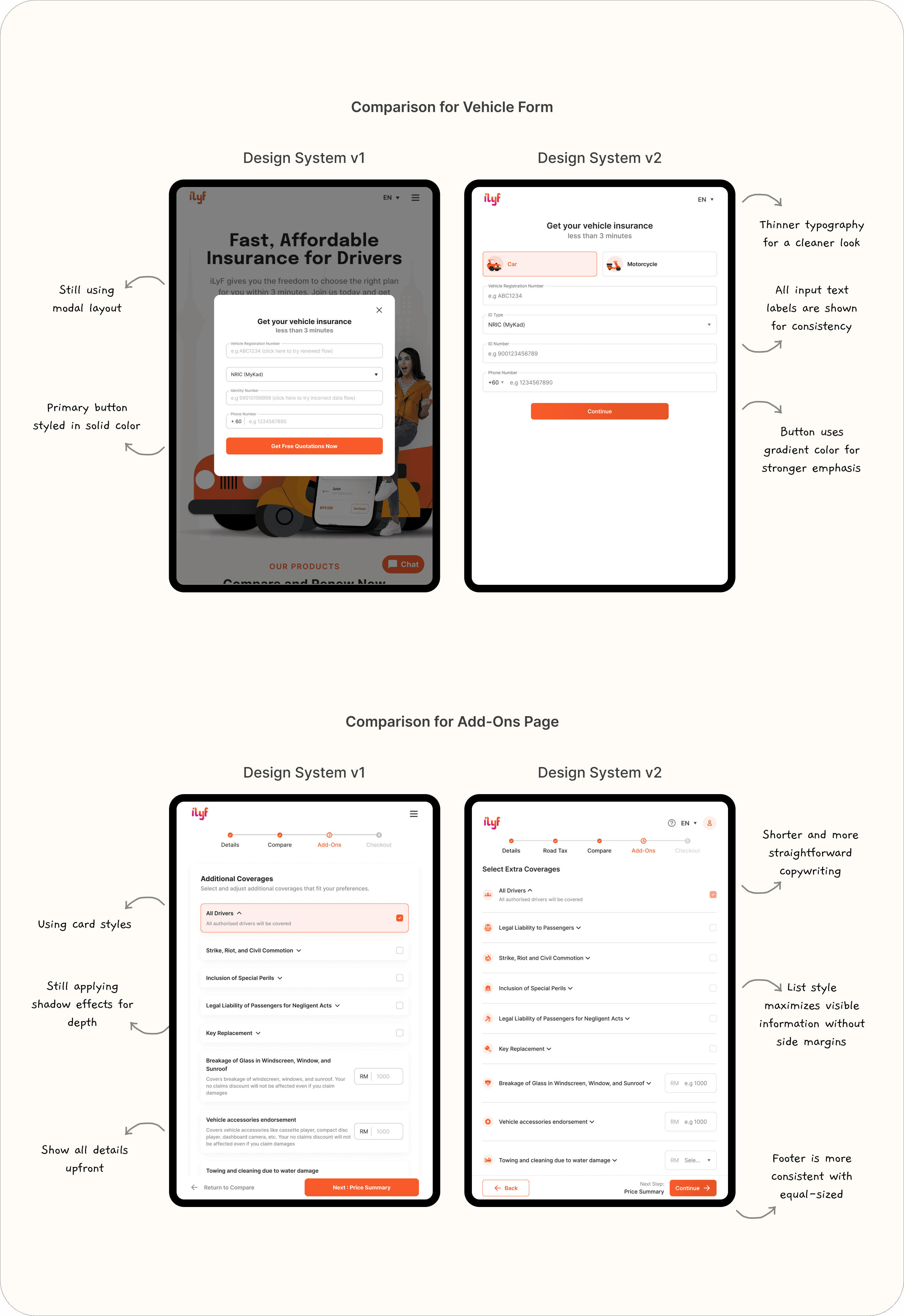
Once we began shipping features across mobile and web, we collected feedback from users. Based on user’s feedback, we noted that the card-based layout felt too cluttered and lacked spatial efficiency, especially on smaller devices. We need something more minimal, clearer hierarchies, leaner use of space, and better scannability.
For v2, I collaborated with other designer, explored several layout alternatives and design refinements:
Switched from card-based to list-style layout with 1-line items to reduce padding and visual load
Improved spacing logic and typography scale to ensure clarity without relying on boxes
Introduced more flexible component variants to cover different edge cases
Removed unused styles, streamlined naming conventions, and made documentation more readable
🎨 Design & Iterate
v1: Foundational System
Built basic components for buttons, inputs, cards, nav
Applied across mobile app (v2 & v3) and first web renewal build
Used to align cross-platform visuals with mobile-first mindset
Simple Figma structure using styles, components, basic tokens
v2: Clean, Scalable Redesign
Simplified color palette and typography scale
Introduced clearer naming conventions
Added support for more flexible layouts
Applied consistently in travel insurance flow and web redesign
Worked with my design teammate and devs to enforce consistency
Reflections
Designing a system taught me the importance of consistency and contrast in creating clean and effective visuals. I realized that even small change (like adjusting type size, spacing, or alignment) can significantly impact the clarity and overall feel of the interface.
I also learned how powerful a design system can be in streamlining workflows. With a shared set of components, I was able to design faster, maintain consistency across pages, and reduce repetitive tasks. Any updates made to a single component would cascade across the system, saving time and ensuring alignment throughout the product.